MANILA, PHILIPPINES — Designing a layout is an essential extension of how your brand would want to be perceived by its target audience. It is the simplest form of communicating with your consumer using graphics, photos, and texts.
Zilingo sits down with one of the up-and-coming Art Directors of the industry, Alexandra Vega from Zilingo Marketing As A Service, and she shares that a layout can make or break a brand message, and she highlighted that a lot of brands have suffered from it. “A brand, whether big or small, must take into consideration a lot of aspects when doing a layout, may it be for social media consumption, a billboard, or an offset material,” she shares.
“In this digital age, with millions of scrutinizing eyes on the internet, and everyone is connected to social media, a single layout confusion or composition mistake can be easily magnified. It is important to carefully craft something and use the customer’s lens in viewing and assessing what works best for your brand.” Vega added.
With that, here are simple design tips and tricks for social media posts that beginners can easily apply to help and guide them nail that shutter and ace that layout, one crop at a time.
Play with natural light
They say a good photo composition is nothing without good lighting. But what if you don’t have the lighting equipment to achieve the look that you envisioned? Here’s a sure-hit protip that’ll save you from the struggle.
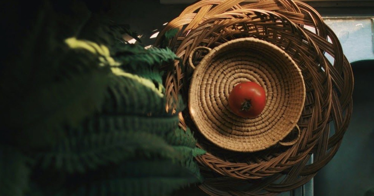
Natural light generally refers to any light created by sunlight. It is abundant and fun to experiment on. Make use of it to your advantage, play around with the direction, the colors, and its intensity to achieve the look that your gunning for. Natural light is abundant, so you just have to familiarize yourself, and maximize its potential to apply to your photography techniques.

Play with your ingredients
Got lemons, oranges, or even Cinnamon sticks at home? Make use of these elements to punctuate your photo layout. Always remember to make do of what one has and let the creativity flow. As a beginner, do not be scared to test and experiment on one’s layout.
Flaunt it with a model
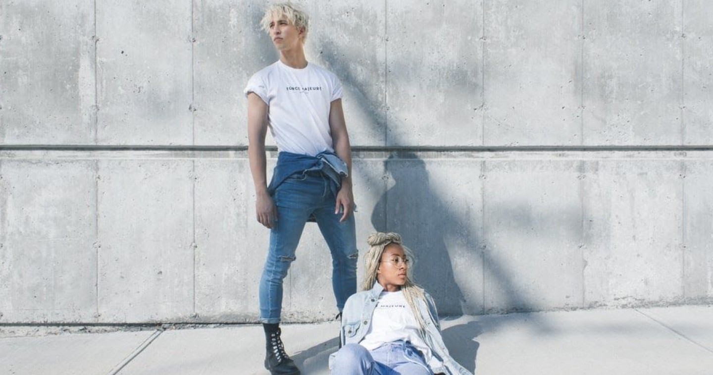
If you have a small budget, you may get a little help from a model, or you can ask your friend to do a test shoot for you. Always remember, that for wearable pieces, the best way to win that fashion photo and showcase your collection is by using a body model to wear your item. This not only beautifies the layout, but it gives the customer a vision of what to expect when the item is worn.
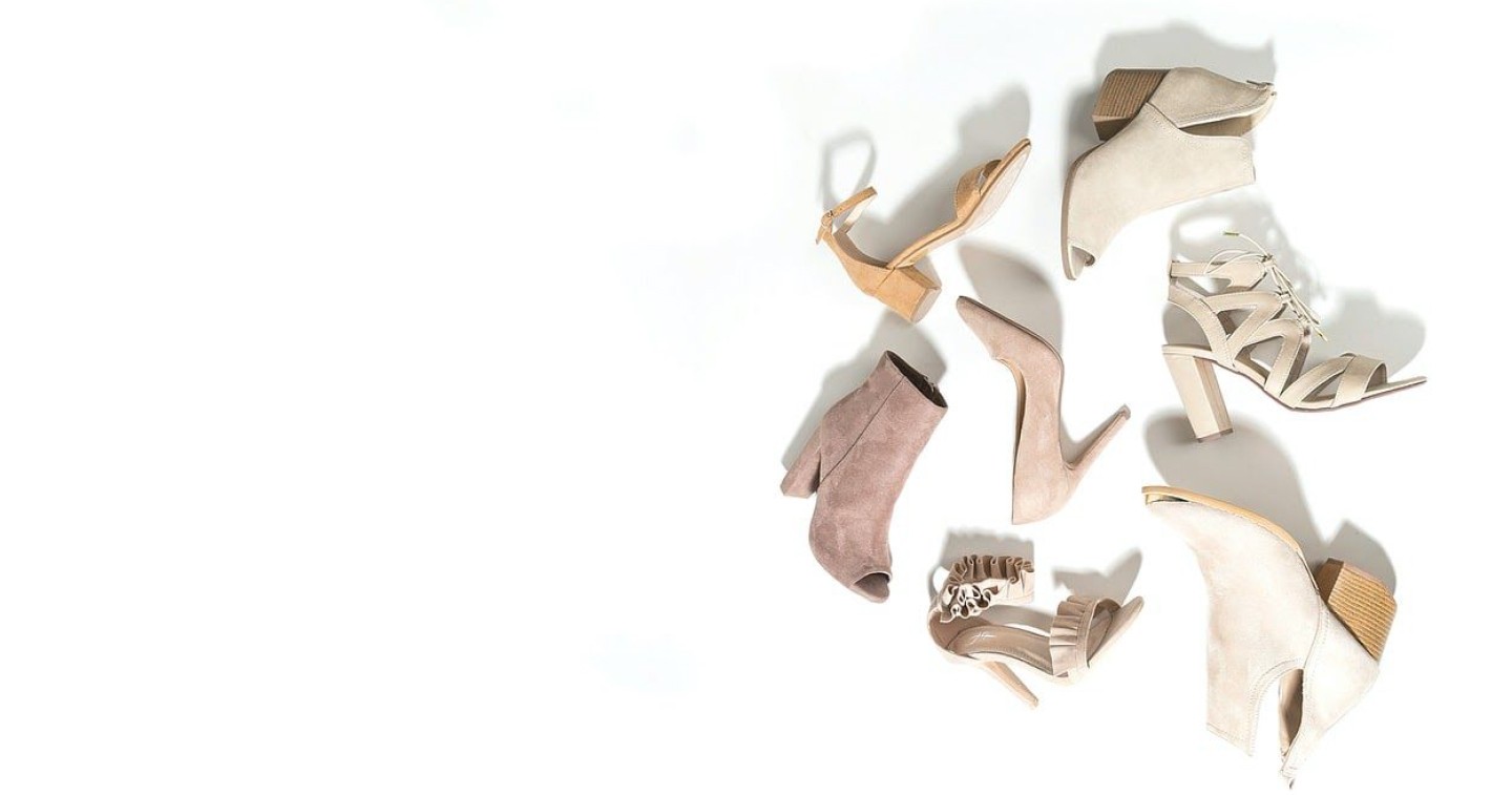
Arrange your items creatively
There is no better way to flaunt your collection by snapping it creatively. Make sure to do it so customers will have a glimpse of what to expect from your shop.

Create a mood board
Be sure that you don’t miss a spot in your upcoming shoot, or even on your feed curation. Always make it a point to use a mood board for reference. Trust us, it’ll make your design life easier.

Time your posts to an audience
Though others may disagree, this tip is still important to take into consideration. Study your page’s activity and know what’s the best time to post to get the most out of it. This, however, depends on what brand you’re promoting, so it is really best to study your stats.


