MANILA, PHILIPPINES — In today’s virtual age, it can be easy to resort to just classifying someone as a digital or traditional artist. But the dichotomy is far from sufficient enough to encapsulate a visual artist’s work. Since digital was first introduced, there have always been artists who have created works of art that married the two.
This is especially true for creative director and graphic communication designer Tina Touli.
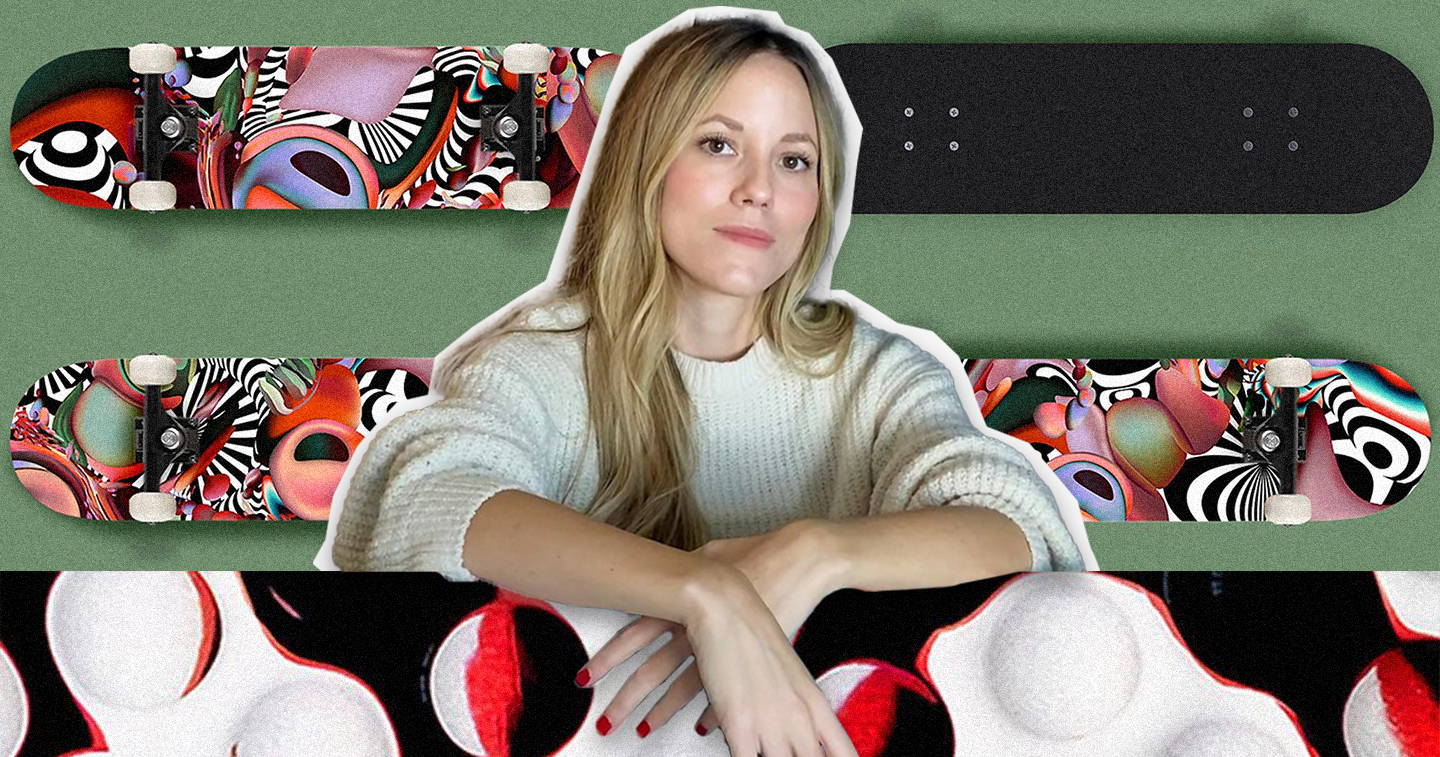
You can find Tina’s genius in many corners of the creative world. Her branding design prowess is undeniable in the projects she’s made for various clients, helping them define their identity with unforgettable visuals and recognizable cues. The grasp she has of her art’s movement and dynamism is evident in her mesmerizing animated and 3D visualization pieces. Words come alive and capture the viewer’s eye through design that perfectly fits the message in her stunning typography work. But, regardless of the plethora of fields that her art occupies, what she’s known for remains the same: creating beautiful design through blending the physical and the digital.
Because of this, Tina always has something new to work with. With her combination of physical and digital comes the opportunity to try different tools, techniques, materials, styles, and processes. And that constant variety and the lack of stagnation in her creative journey and experimentation is one that always shows in her distinctive, evocative, and inventive designs.
Following up on her insightful talk about her unique creative process and the art she produced with it in August at Graphika 2022, adobo Magazine chats with Tina about the beginnings of her desire to create, how she found her niche, and what it’s like to take on projects for established brands.
adobo: How did you start getting into art and design? What were some of the most significant influences that shaped who you are today as a designer?
Tina: I always loved communicating and expressing myself through any form of art. Since I was little, I was keen on dancing, drawing, playing music, and others.
A friend of my parents had a piano, and whenever we were visiting, I was always trying to play some kind of a melody. After I implored my parents for a while, they signed me up for piano lessons, which led me to study at a music secondary and high school. It was not only about music but also about art, acting, drawing, etc.
Soon, I realized I enjoyed playing the piano and the violin just for me, to express myself. it was not really my dream to become a musician. I was thinking more of becoming a mathematician, a physicist, or an architect until a friend told me about design, a field that would allow me to combine everything that I was passionate about — audio, motion, visuals, etc. I got into a Graphic Design course and really soon I fell in love with design and creativity.
You’re mostly known for blending the physical and the digital. Can you tell us more about when and how that started to become your niche?
I grow up in a family environment where “making” was the key, from refurbishing furniture to constructing parts of the house and creating wooden toys. As you can guess, since I was very little, I’ve been a “maker” myself, continuously exploring and creating, from little sculptures to balloon animals and paper crafts.
The impact is clear on my designs, working a lot by hand, constantly blending the physical and the digital worlds. Personally, I did not think about defining my visual style and identity, it came naturally through practice. I would describe it as a mirror image of myself.
What are things about that mix that excite or stimulate your creativity the most?
Stagnation is one of my biggest enemies. Being open-minded about mediums, processes, and techniques is a must. Keep challenging myself, experimenting, and exploring. You will often find me experimenting with various tools besides the computer, from a 3D printer and a laser cutter to materials such as oil, water and colors, orbeez spheres, glass lenses, papers, ribbons, and more.
My goal is always to learn and create something new, something different from what I have made before.
You’ve worked with many established brands and clients. What do you think is key in making sure your design isn’t straying too far from a brand’s identity and what makes it recognizable while still elevating or putting a fresh spin to it?
Brands usually approach me with references from my portfolio in mind that already feel aligned with the brand’s identity more or less, commissioning me to create something based on my very own creative voice/style. But a couple of steps good to follow in order to stay close to the brand’s identity and values is to keep checking against the brief provided during all steps of the creative process, placing your work in progress next to a range of the brand’s applications to confirm consistency while at the same time a fresh approach, and checking the work against what’s “on the market” to make sure that it is recognizable but at the same time it stands out.
When it comes to creating design for others, what goes into preparing for a project before you start working on the design itself? How much research goes into it and what are things about the project you want to flesh out first?
I always start by reading a couple of times the brief and researching the brand, product, etc. that I am designing for while keeping notes of any keywords, messages, and any key photos or visuals.
Analyzing all the information and trying to understand the needs of the project. Seeking inspiration from the brief itself as well as our immediate surroundings, the world around us.
I am inclined to believe that anything around us that can stimulate any of our senses can be inspirational and an “object” for investigation that can become a tool for design, a prototype, or even the design outcome itself.
Tina also shared with adobo Magazine some of her favorite projects to work on and how they challenged or enriched her design process. Here’s a behind-the-scenes glimpse from Tina about what it was like to create her memorable designs for &pizza, Skullcandy, and Z by HP.
A paper sculpture of two ampersands, the brand’s symbol, connected has been created, photographed, and edited digitally in order to shape the packaging of &pizza for the Christmas 2019 period. The graphic has been inspired by the Christmas present ribbons along with the concept of connection and communication that represents the brand. “Stand together and lift each other.”
It has been a fascinating project to work on, having the freedom to express the brand values in a creative way. What was interesting, though, was the process of creating it. I was experimenting without having any high expectations and definitely without imagining that this could ever turn into the final outcome. I spend some time exploring the possibilities of connecting the two paper ampersands cut out of some basic cheap thin paper. I photographed the composition with my phone to check my progress and shared the initial draft with the client. They loved it!
Of course, when working by hand there are certain limitations, there was no way to recreate it with a good quality paper and light it the same way as per the draft to get a similar enough outcome in a good quality paper sculpture. So, I had to use that original lower-resolution picture taken with my mobile as my basis to shape after hours and hours of retouching the final graphic.
Skullcandy “Blissfull” Campaign
Tina: During the time of the pandemic things felt a bit tough, and everyone could use some positivity. In whatever small way Skullcandy could, they wanted to help inspire some good vibes. That’s why the Mood Boost, a campaign with a mission to boost mental health, one uplifting mood at a time, has been launched.
For the month of April 2020, Skullcandy approached me to help bring the Blissful mood to life. I have been provided with a specific mood and color palette (green earth tones with red secondary colors) and the freedom to define my own interpretation of Blissful while creating a digital toolkit for the campaign.
A print of the hero artwork was bundled with limited-edition earbuds. Re-interpreted Skullcandy “skulls” have been designed using the Blissful mood and its’ color palette as a theme. Skullcandy’s internal design team moved those elements into production, creating environment design graphics for short-form music video performances and interview content, where the artists share stories and thoughts on the mood of the month.
“Create Anything, Anywhere, Anytime” Z by HP Campaign
Tina: As designers, we don’t want to think of any technical issues and limitations while creating. We want to have an uninterrupted creative experience and freedom to Create Anything, Anywhere, and Anytime. The Z by HP collection provides limitless possibilities, breaking any boundaries between creativity and technology. It provides devices that become an extension of us and our creativity.
One of the most common questions that I have been asked, is where do I seek inspiration from? Creating a campaign showcasing new techniques and ideas that will hopefully be a reference and inspiration for other creatives was the aim of this ad. The key messages of Create Anything, Anywhere, and Anytime have been designed using various techniques, from physical experimentations to 3D visuals and sketchy graphics, reflecting the concept of a device created by a group of creatives for all types of creatives!


