MANILA, PHILIPPINES — Distance and a fresh perspective can make one’s heart grow fonder of home and all things familiar.
Seeing your current scenery through different lenses can certainly reignite your love for a home you’ve been born and raised in — from merely a paint color seemingly plaguing one’s house, to maximalist walls of minuscule memorabilia.
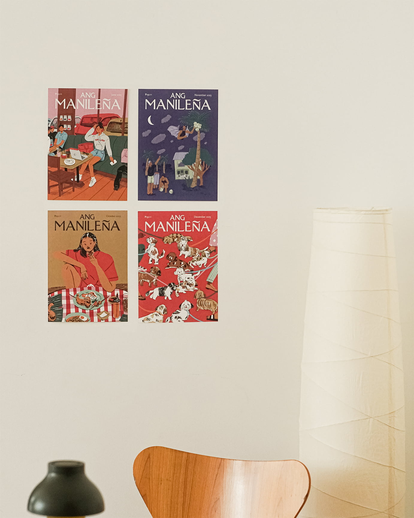
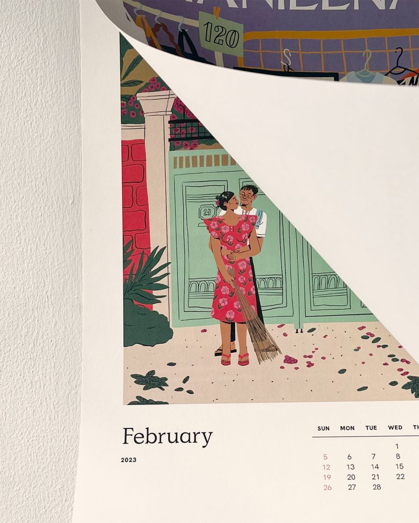
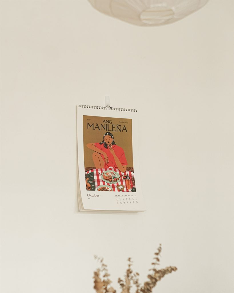
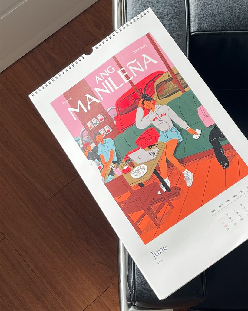
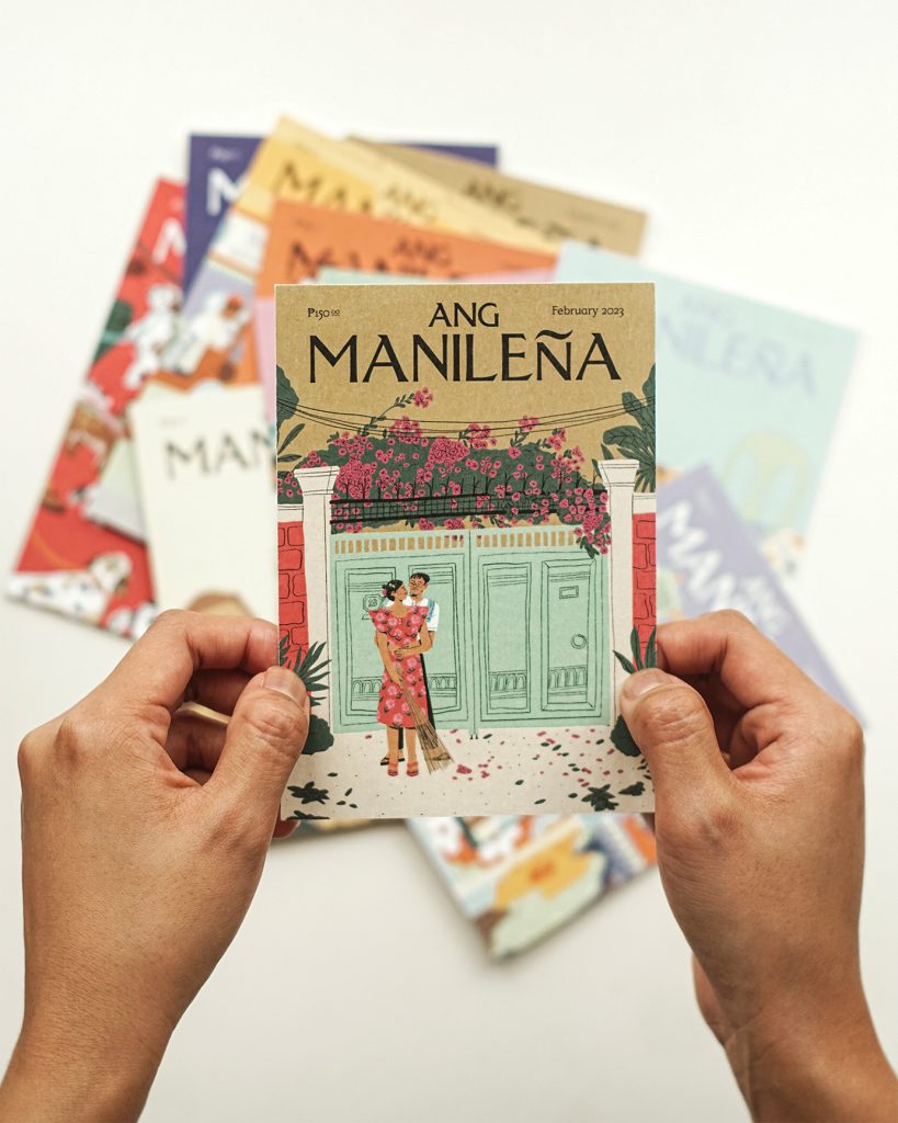
Inspired by the picturesque covers of The New Yorker, Manila-based illustrator and graphic designer Ross Du sheds light on the homely aspects of Filipino culture in her faux magazine cover series titled “Ang Manileña.” This endeavor is also inspired by other faux magazines such as The Tokyōiter and The Parisianer, that similarly celebrate their namesake cities.
In this feature, we chat with Ross to learn more about the creative process behind her art series.
Your works seem to focus on Filipino culture, with a particular focus on the Manila lifestyle. Can you tell us your favorite aspect of Manila/Filipino culture and why?
Outside Ang Manileña, I think my work contains a lot of visual language from Manila culture because I tend to depict comfort and the familiar. That just so happens to be in the context of “home.” While I was intentionally showing the context of Manila in Ang Manileña, even before this project, I drew whatever felt familiar to me. I think more than anything, my favorite aspect of Manila/Filipino culture is simply that it is home. When I see mint green walls and bougainvillea flowers hanging over the spikes above gates; when I eat the sweetest mangoes; when I’m stuck in traffic — even when I’m not in the Philippines, it all just reminds me of home.
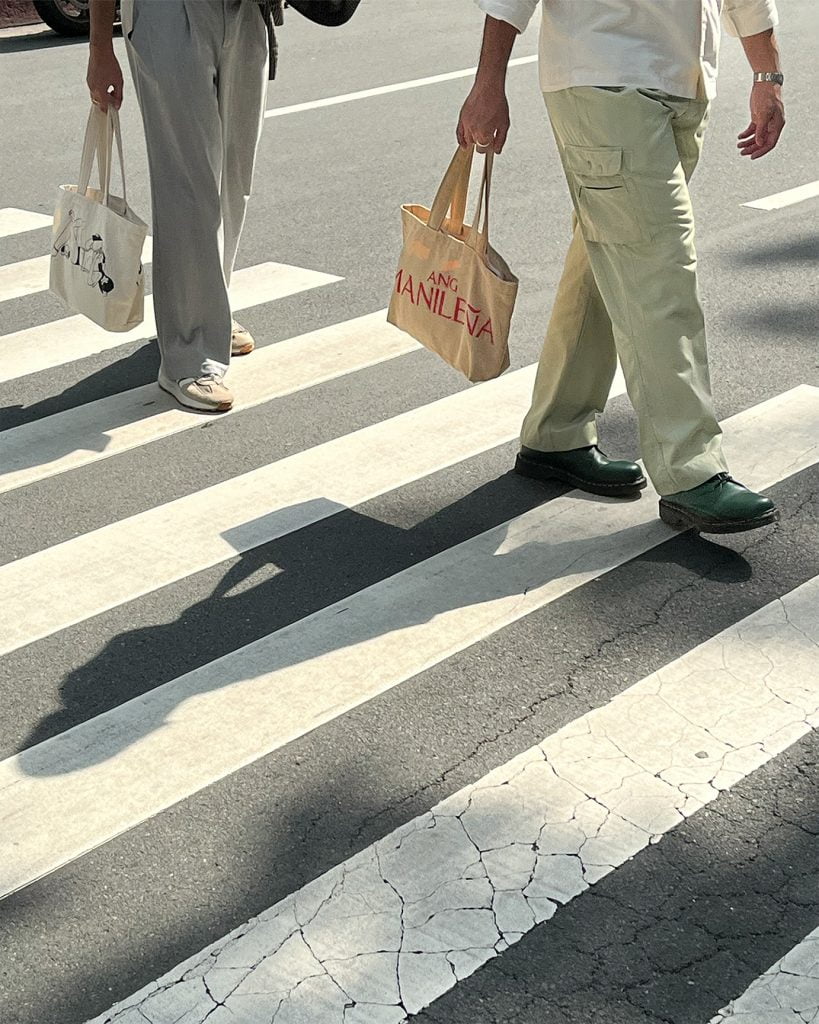
Ang Manileña product photos courtesy of JM Avenido
What were some key elements you incorporated in your designs for Ang Manileña to effectively communicate Filipino culture and identity?
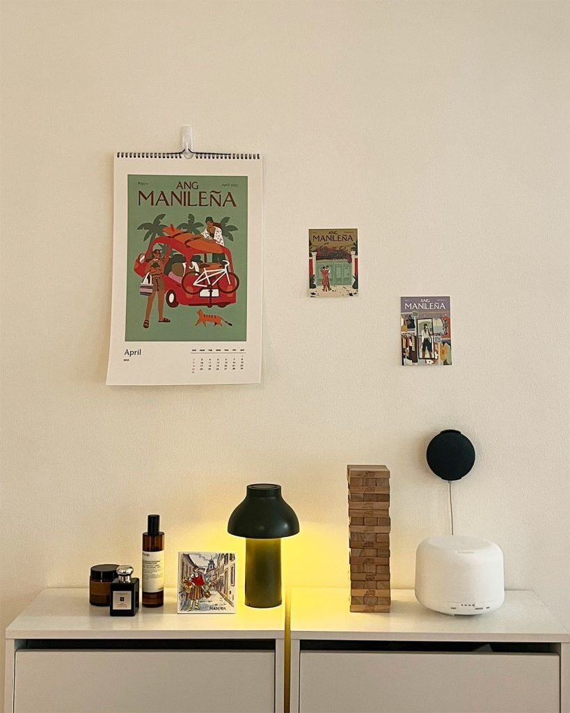
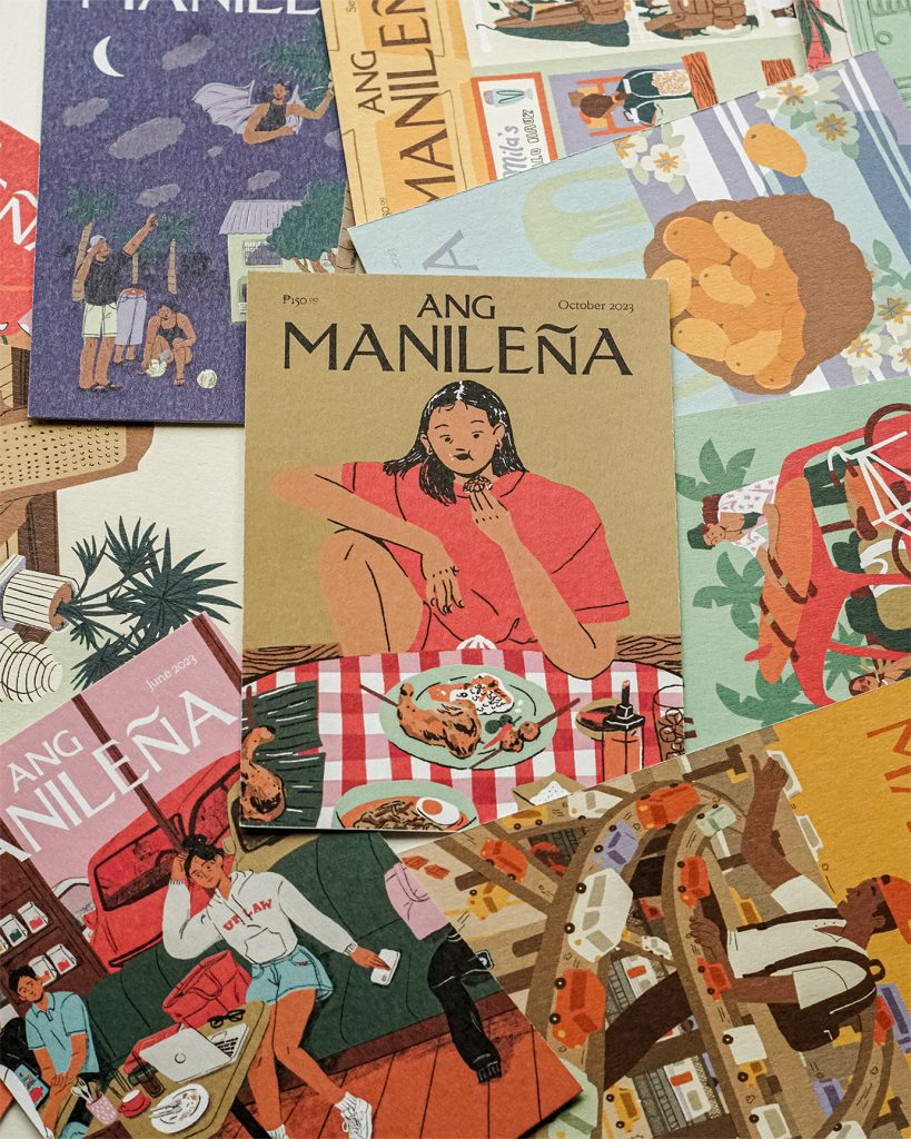
I think each illustration explores different elements since what I wanted to do with this project is expand the visual vocabulary I have about what it means to be from Manila. But after reviewing them all, there are certain things that I did notice were recurring. It’s nothing profound, but I depicted car culture a lot, for example. I also used wood furniture and texture now and then. Tropical flowers and plants too, of course.
The only element I made sure to use consistently to tie the whole project together was color. There were two color palettes I made that are used within the whole collection, featuring a variety of colors I feel like can be seen around Manila. Some notable mixes are pastel tones of greens and purples (coined as cooling colors by Tropikalye) and harsh warm golds and reds.
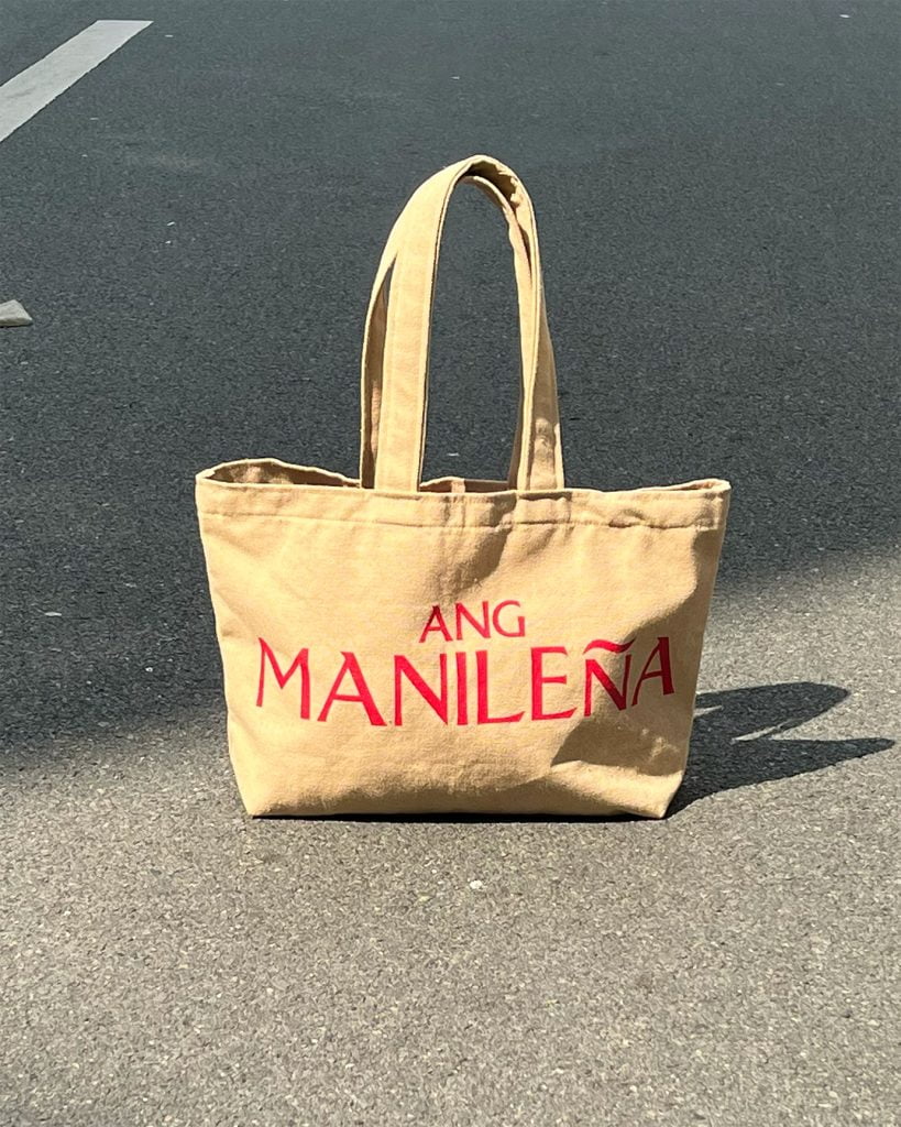
Ang Manileña product photos courtesy of JM Avenido
Is there a particular cover that you really enjoyed working on? Why so?
Probably the March cover. That came after some more detailed and stressful illustrations, and I just wanted to illustrate something easy and fun but effective. I just came from a trip to Thailand at the time and whenever I tasted a mango there, I kept thinking that the Philippines truly has the best mangoes. So I just wanted to emphasize that in an illustration. I think it’s the most distilled thing I drew for the project, but I think it evokes memories just as well as the others.
Are there personal/friend anecdotes or specific cultural nuances that inspired your designs for Ang Manileña?
A good friend of mine, Clara Cayosa of Tipong Pilipino, made the masthead of Ang Manileña. She is also one of the people who inspired and encouraged me throughout this project. I visited her in La Union sometime early in the year, where we shared a week of creative conversations, which fit well with the continuously growing creative energy in La Union. That trip inspired me to lay down the foundations of Ang Manileña, which had been a personal project I’ve been wanting to pursue for the past three years. That trip also inspired the April cover.
Are there any easter eggs or any little details you love to include in your illustrations, particularly for this project?
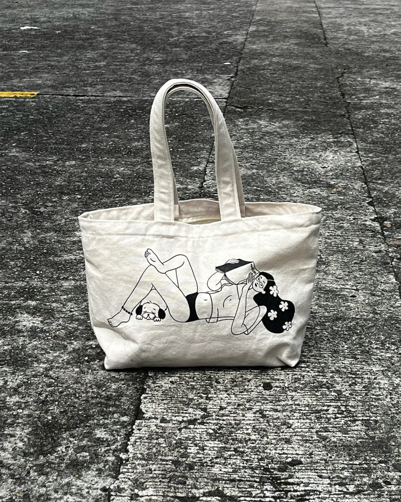
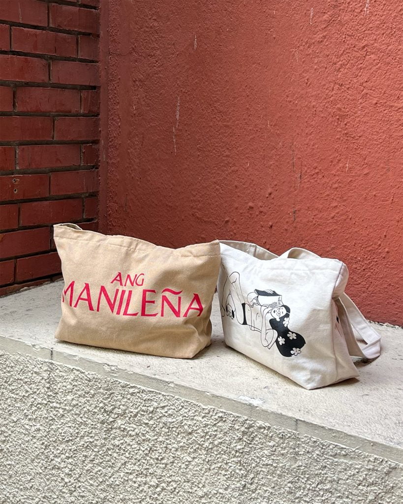
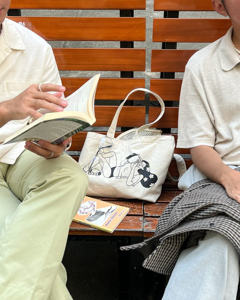
On one side of the tote bag, I illustrated a girl in piña top reading a magazine. I’ve illustrated quite a few girls in see-through piña tops in the past few years, whether in Filipiniana or in modern cuts. I just think it adds a lot of personality and carefree-ness that makes one look like they feel at home.
Ang Manileña product photos courtesy of JM Avenido
What keeps you inspired throughout your journey as an illustrator?
When people tell me how my work makes them feel. I’ve heard different people say that my work makes them feel seen, warm, or happy. Recently, I’ve been lucky to be on trips to show my work in Bangkok and Kuala Lumpur. I was touched to hear people from those cities say that they could feel a connection with my work — that it felt new yet familiar. That human connection through culture, and beyond it as well, inspires me a lot.
Get your hands on Ross Du’s Ang Manileña posters and postcards at https://rossdu.store/ and follow Ross on Instagram to see more of her works at https://www.instagram.com/rossduu/


