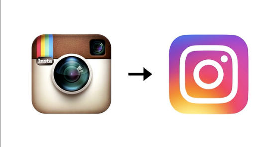
Users of Insagram woke up this morning and probably noticed something different when they upgraded to the latest version of the app on their smartphones. The classic logo that looked like a vintage camera was replaced by something with a lot of white and some gradient shading. In other words, it’s very different from the logo that Instagram users have gotten used to since the app gained popularity.
Ian Splatter, the head of design at Instagram, said the new app icon is a distillation of the original. “As a part of our process, we also asked people at the company to draw the Instagram icon from memory in five seconds,” Splatter said in a blog post. “Almost all of them drew the rainbow, lens and viewfinder.”
In a sea of many colors and images on smartphones and other mobile devices, the image of the vintage camera made Instagram stand out, as well as giving it a sense of history as it harkened back to cameras of the past. This new logo, however, is anything but that.
“It may well go down as one of the biggest design fails of the year,” Tim Nudd, the creative editor at Adweek magazine, wrote in his assessment of the reboot. “It’s a very forgettable image that will get lost on people’s phones amid the thousands of other similarly uninspired designs of most tech apps. … Can we change it back?”
For its part, The Guardian laments that the classic logo has “been replaced by a background swirl of sunset colours (orange, yellow, pink, purple) and a white outline of a camera. As if the camera was murdered, and chalk was drawn around its body. Murdered at sundown.”

Aside from the main Instagram logo, the company’s companion apps Boomerang, Hyperlapse, and Layout also have updated their designs. Also, fonts on Instagram are now black while notifications have changed from orange to red.


