MANILA, PHILIPPINES — CNET has been long known for its tech reviews and digital news but over the years, it has added several other sections into its repertoire. Recently, it has introduced a new visual identity. The agency behind the redesign told adobo magazine how it transformed the tech-review site into an editorial-first outfit.
Reach, relevance and loyalty were at the top of mind when trying to renew interest in existing audiences and getting new ones.
“In our discussions with CNET, it was clear they were looking for a change that matched their ambition—adding depth, breadth, and strength to their editorial muscles,” said Tom Elia, Creative Director at COLLINS.
Elia shared that they at the agency knew the brand well and used it extensively because of the media outfit’s approach to news — not just stopping at current affairs but making information applicable in practice.
“They [CNET] pride themselves on providing expert reporting and advice you can apply to your daily life.”
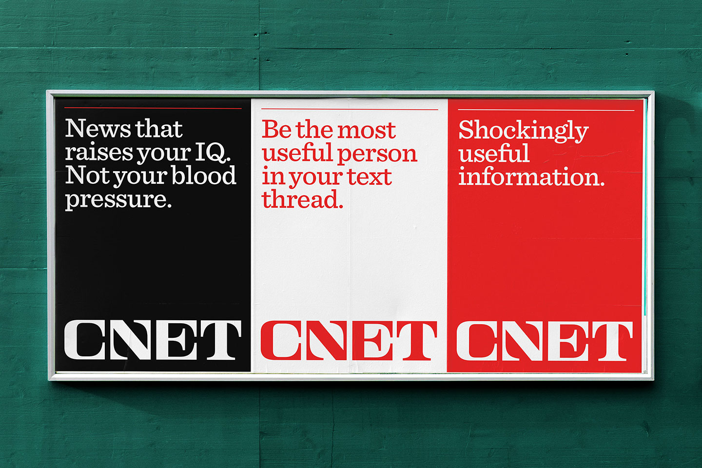
One particular focus of the redesign is the wordmark itself. For this, the team explained that the attributes of the old typography had to bend in the new direction.
“Looking at confident, assertive mastheads from legendary newspapers and magazines, we wanted this wordmark to feel confident and memorable in similar ways,” explained Jump Jirakaweekul, Design Director at COLLINS.
He added that capturing CNET’s ambition led them to look at established news outfits that were “bold monuments to the freedom and power of the press.” Hence, manifesting in a more defined, crisp new custom serif.
Yet what they had in mind for the design had to outdo the iconic lowercase logo that is reminiscent of the early internet days. “We wanted to bridge the past and the future while evoking both familiarity and surprise,” added Jirakaweekul.
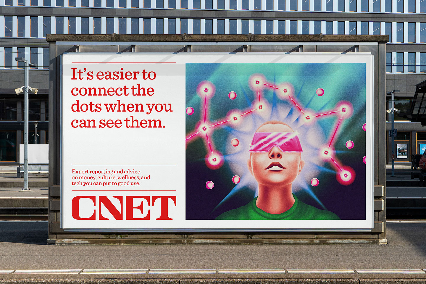
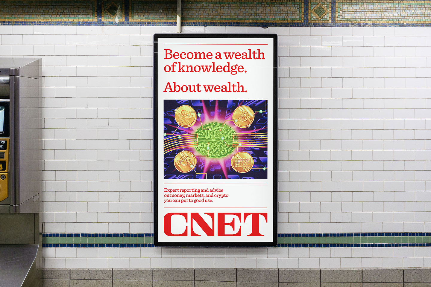
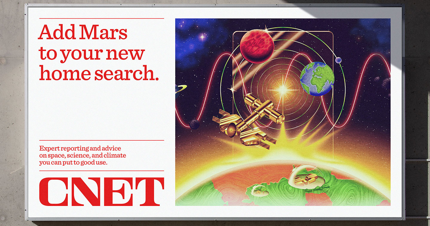
COLLINS’ work at the new visual identity also included custom illustration styles, engaging motion graphics, and new site navigation.
Summing it up, Jirakaweekul said, “Whether it’s an article or an ad, we want people to see imagery that, when paired with a headline and story, ignites their imagination. Who needs cookie-cutter visualizations? We want CNET’s audiences to be inspired to use the news.”
