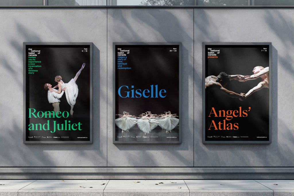
TORONTO, CANADA — Award-winning, Toronto-based multidisciplinary brand and design studio Bruce Mau Design (BMD) has crafted an all-new visual identity and expression for The National Ballet of Canada, marking the nearly 75-year-old institution’s first rebrand in almost two decades.
Seeking to merge classical and modern/future-embracing aesthetics, The National Ballet of Canada sought its hometown studio’s creative and technical talents to develop a brand identity that would herald a more creative, inclusive, and bolder organization. “We were tasked to create something that would invite more people in,” BMD Chief Creative Officer Laura Stein recalls. “We created a new wordmark that acts as an invitational narrative. This helps to position them differently — more open, more creative.”
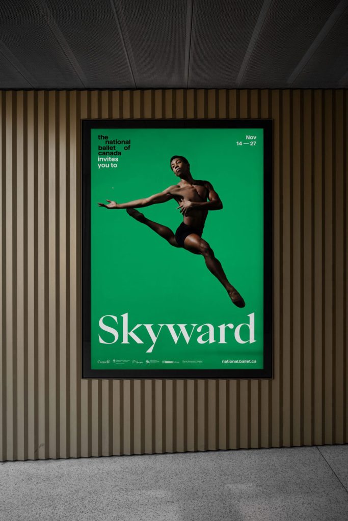
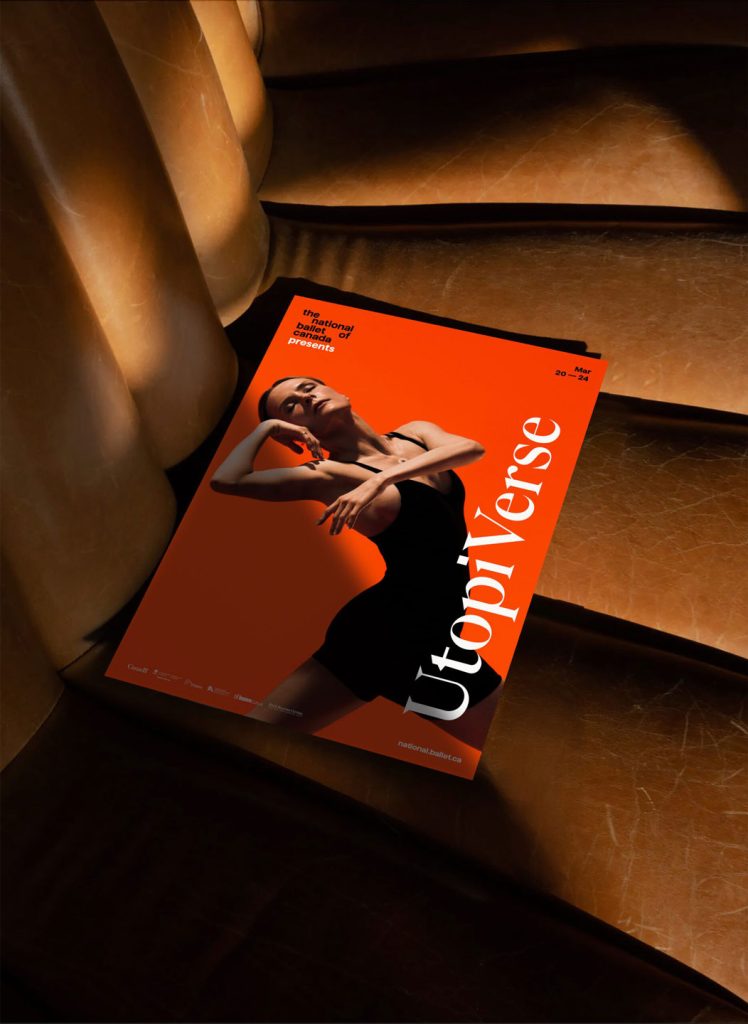
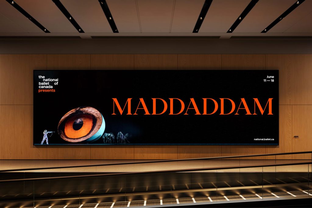
The wordmark, in fact, serves as a foundational piece of BMD’s new visual redesign for The National Ballet of Canada. “The logo is a wordmark that is also the beginning of a narrative,” Laura explained. “So, type needs to flow seamlessly from the logo. We worked with Displaay Type Foundry to develop a glyph that would allow designers to type in the logo with a keystroke and simply continue typing to write the narratives. The tool allows anyone to easily use the logo and write a narrative without fussing with alignment, scale, leading, ensuring that it looks good every time. [It was] very useful for the creative team at The National Ballet of Canada.”
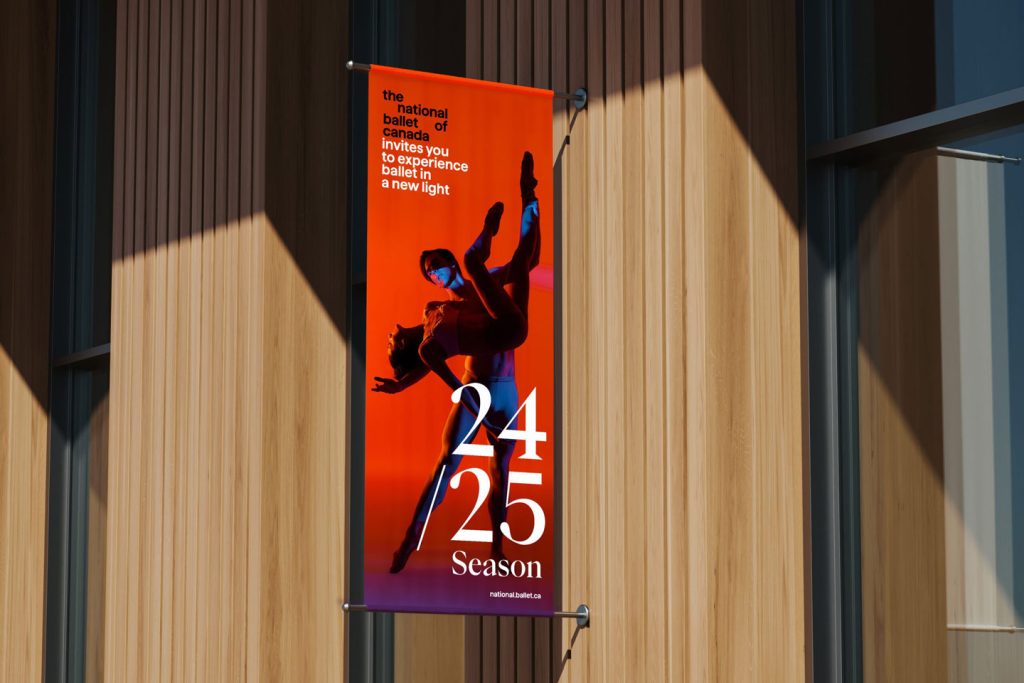
In turn, BMD has transformed the full wordmark into lowercase using a robust typeface that feels more open and welcoming. The studio also moved away from the brand’s older, dark pink and what might be considered a gendered palette to a very vibrant set of jewel tones. In addition, BMD’s efforts for The National Ballet of Canada include creating the art direction for photography, layout principles, motion behaviors, identity and motion assets, and guidelines for how to use them. Perhaps most significant, however, is that BMD had to develop key messages to convey its Storyteller concept and draw audiences in. “Our Storyteller concept helps address ‘the uncertainty gap,’ where people are less likely to engage in something if they don’t understand it,” Laura noted. “The wordmark’s narrative can tease some of the story so that people who know nothing about a ballet such as Onegin understand that it deals with exciting and dramatic themes such as love and betrayal.”
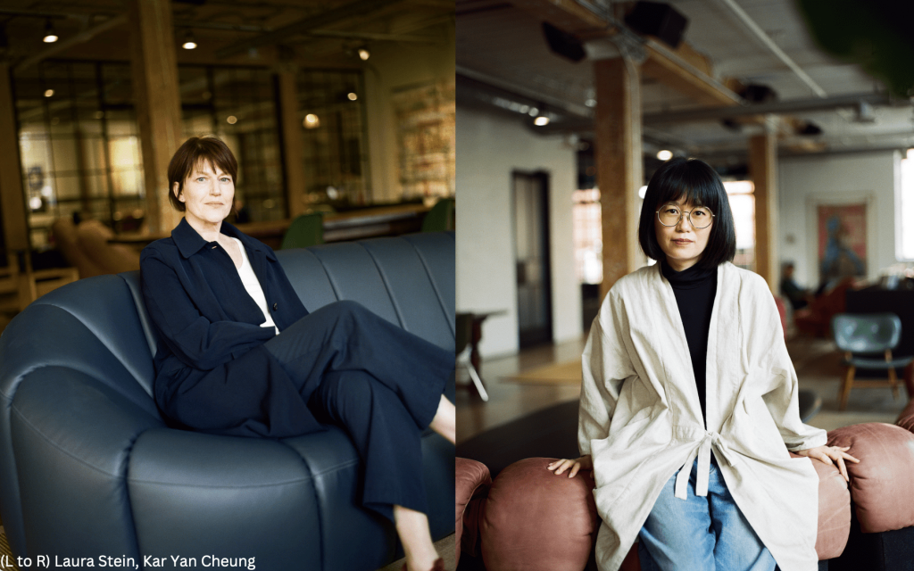
To attract existing and new audiences through a redesign, BMD also faced strategic challenges according to the studio’s Director of Design Strategy, Kar Yan Cheung. [“We had to create] a brand for both old and new audiences, ensuring we honor the tradition of classical ballet while also paving the way for the future of ballet and more contemporary ballets and stories,” she said. To accomplish this, she revealed that BMD collaborated closely with The National Ballet of Canada by holding a number of workshops as well as launching a “pop-up studio” with the entire company, conducting interviews with key stakeholders, touring the site and attending several different ballet productions throughout the season.
As a result, BMD has brought to fruition a rebrand that not only respects tradition while shaking off the elitist, highbrow image often associated with ballet but has helped The National Ballet of Canada evolve into an organization that reflects the future, one that is more flexible and welcoming. “Ballet is often seen as inaccessible, something only for the wealthy, and this is a barrier to newer and often younger audiences,” said Kar Yan. “The idea was to pull back the curtain and bring people up close to what is happening at The National Ballet of Canada, which is already known for its excellence, but we wanted to signal being more innovative and a bold leader for the ballet world.”
Echoing and expanding on these sentiments, The National Ballet of Canada Artistic Director Hope Muir added, “This new brand draws you into the stories we share. The visual identity is bold, personal, and inclusive, with creative taglines that spark the imagination and invite conversation. It isn’t just a logo, it’s a philosophy that has to represent our company and culture, our value system and how we want to move forward as an organization. The Storyteller reflects the values and energy of the National Ballet today and asserts our commitment to an innovative and accessible future. We are thrilled to present ballet in this new light.”
The National Ballet of Canada’s visual identity signifies just the latest ambitious, game-changing effort from BMD, which has become one of the most renowned, in-demand brand and design studios thanks to high-profile work for the likes of Infiniti, Sonos, and the Zayed National Museum. In the process, BMD has garnered Cannes Lions and D&AD awards and honors from Adweek and Fast Company, among many other accolades.