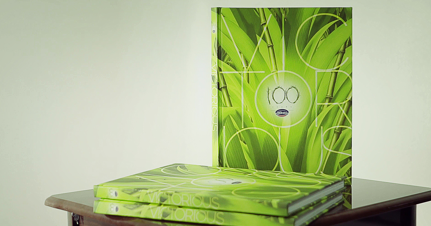
MANILA, PHILIPPINES — When Victorias Milling Company, Inc. celebrated its centennial year two years ago, it was only fitting that it came out with a coffee table book detailing its rich history. Since its publication, the book has gone on to win two highly coveted awards — the Gold Anvil from the Public Relations Society of the Philippines and, most recently, an Excellence Award from the Philippine Quill Awards of the International Association of Business Communicators (IABC).

Mark Wesley Pahate, the Creative Director behind the book, talks about the design process that it underwent. He also shares his experiences and insights on book cover design and how integral the book design concept is in coming up with the book’s cover art.
Pahate, who runs his own independent full-service advertising agency, Eggshell Worldwide Communications, is also the creative force behind the streetwear brand, What?. He graduated with a degree in Advertising Arts from the University of Santo Tomas College of Fine Arts and has been an art director and associate creative director at McCann-Erickson and Harrison Communications prior to starting his own agency.
Here are excerpts from an interview with Pahate:

The latest coffee table book you designed “Victorious” won a Gold Anvil and a Quill. What is your design inspiration for the book?
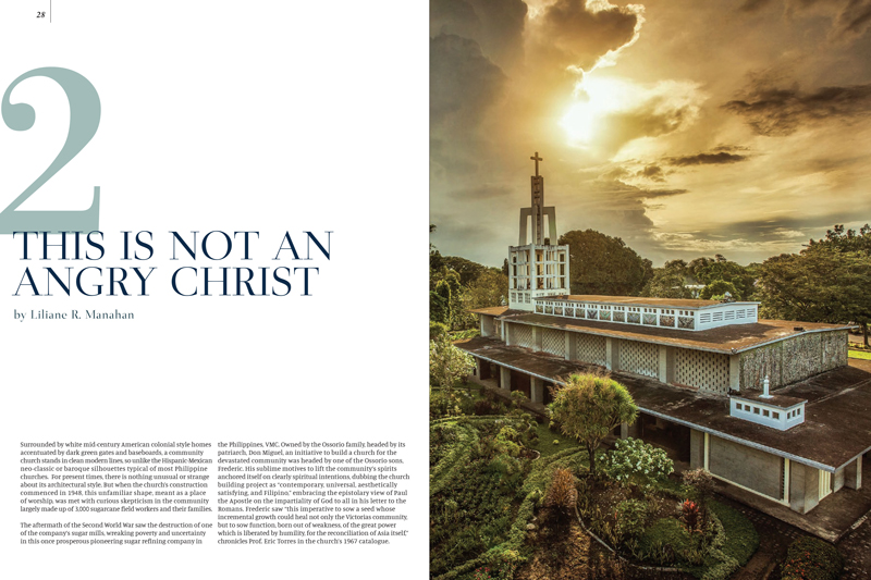
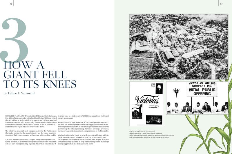
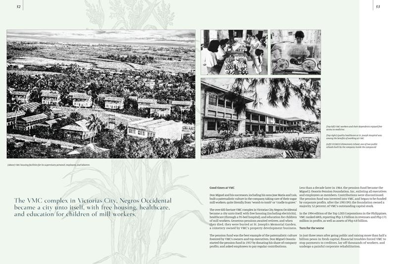
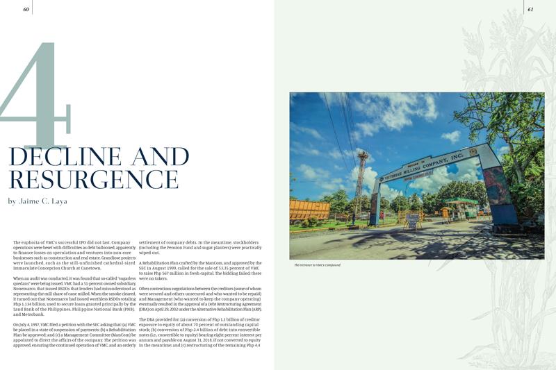
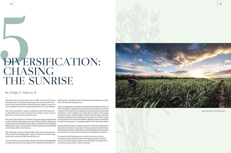
I’ve always been fond of nice old things, especially things that have to do with aged art because of their analog and timeless aesthetic. The design for this coffee table book was based on illustrated flora books. Since the sugar cane plant was a major part of its story, we looked for an elegant but non-corporate visual concept to incorporate into the design, and that is how we arrived at illustrated flora.
What is your design process like? How do you come up with the design of the book covers?
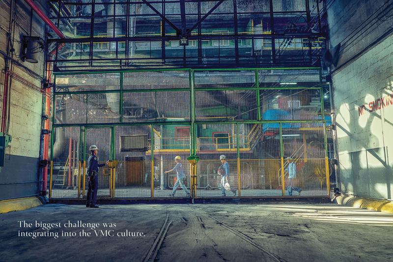
For this book, we were really immersed in the history and the current state of the company. Staying in Victorias City through several visits and plant tours really helped in the ideation process. Conversations with the clients give us an idea of the tone and “personality” that the project was probably going to have. Then we usually come up with several ideas or themes. When the main idea or theme has been decided then we proceed to develop design studies.
Why do you think coffee table books remain relevant?
Coffee table books, like printed books will always have a place. There is something about flipping through pages and viewing photographs and reading light passages. The activity of consuming books of this kind is a whole process that will never get old, as is collecting them and placing them in your library or in one’s living room. It’s like a piece of music or a favorite movie that you come back to every once in a while and even show to friends or family.
When did you start designing book covers? Has your process of designing book covers changed over the years?
Designing book covers, of course, is the most exciting and stressful part of the book design process. It will make or break the book. Designers know that it is also the part of the design project that everyone seems to want to contribute to. Therefore, it is often the source of a lot of discussion among all the concerned parties.
When we come up with the design, we already include the cover design in the presentation as it is a major part of it and clients expect to see it. It excites them the most. However, the cover design is an extension of the design concept. The design concept dictates the cover design, not the other way around. That is our philosophy. Our goal is to make the cover eye-catching and innovative but first and foremost, it should be a reinforcement of the book’s overall design concept. Even the choice of printing effects has to be evaluated, whether it enhances the concept or be a distracting gimmick.
For this particular book, it was fortunate that the clients were fully onboard — with the design idea and the cover design that came with it — from the start.
How did you get into designing coffee table books? What was the first coffee table book you worked on?
The first coffee table book we worked on was for the Philippine Chamber of Commerce and Industry back in 2004. Back then, we came up with the design and laid the entire book out between me and one other designer. All-nighters, deadliest deadlines, and energy drinks. It was followed by another memorable project, a book for Tanduay Distillers’ 150th anniversary. We were already immersed in Negros by the time the Victorias Milling book project was offered to us. Prior to that we already did Absolut Distillers’ coffee table book. We came up with the title Absolut Change to reflect the company’s transformation to becoming the country’s first and most successful sustainability powerhouse. From 2004, we have evolved from designing books to becoming a full-service agency, but we are most excited to do passion projects like books.
What are the challenges of designing book covers? How is it different from designing other materials?
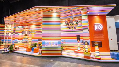
It’s the first thing you encounter, so it has to be eye-catching and innovative to stand out. However, budget, deadlines, and production constraints are always a concern. We once designed a cover with a hologram that really turned out well. It was the Pag-Ibig Fund anniversary coffee table book. We had to source the hologram abroad. First, we shopped from suppliers here, but we could not find the right one. We tried to source it from China, Vietnam, and Singapore, but it was this company from Taiwan that was able to render the design the way I envisioned it.

Who are the book cover artists you look up to?
Dave McKean, who used to do all the Sandman (a popular American comic book series created by Neil Gaiman) covers, was a major influence. Also Stefan Sagmeister and David Carlson, especially his typography work. I also like to look at Japanese graphic design because of its ability to balance outrageous ideas and minimalist aesthetic.
What is your advice for young designers who would like to make a career out of designing book covers?
Don’t get stuck. Explore. Even if it looks crappy at first. You can always work on it. Just don’t get stuck. If it doesn’t excite you, it won’t attract anyone else.

Do you have an upcoming book project?
Fortunately, we are currently working on the Toyota Dealers Association coffee table book. The plan is to launch it by the second quarter of the year.
Digital technology has enabled more people to create on their own. Do you think that companies would be less dependent on agencies because of this?
Creativity can be expressed through more channels today and that should always be viewed as a good thing. Creative minds cross-pollinate each other. New ideas make life generally richer and that I will always get behind. Of course, some content is worth clicking on and some, not as much.
Creative agencies are always evolving and, I believe, are needed by marketers more than ever because their professional knowledge and technique give them the best chance to cut through the glut of content out there, especially (and importantly) if you’re the type willing to try new ideas out.
That is why we’ve decided to move into creating our own brands with What? (A brand of apparel released by Eggshell in 2017.) These creative outlets give us a way to get out of our lane, so to speak. This way we have a sort of “laboratory” for communication ideas. And what works here we can apply to our other clients.

