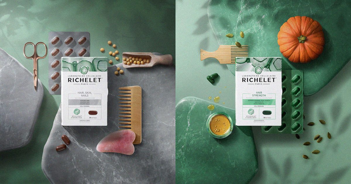
PARIS, FRANCE — Creative agency Free The Birds has completed a major revitalization of French beauty supplement brand Richelet to reinforce its place as the cell expert in the supplements category.
Jean Antoine Lucien Richelet introduced his first innovative product, the Richelet Depurative, in Paris in 1905 providing welcome relief for sufferers of a range of skin ailments. The range eventually expanded, resulting in the release of Richelet’s first antioxidant food supplement in 1988 using the philosophy of natural, nourishing formulas rooted in their brand heritage.
Several other supplement products followed culminating in the refining and optimizing of the advancing science into Cellenium, a completely natural origin patented formula that nourishes the skin cells deep down every day. Richelet has its sights firmly set on being the number one global beauty supplements brand and wanted the visual identity to help propel them towards this ambition.
This visual identity along with its accompanying brand world had to be contemporary and powerful and capable of uniting all the brand assets including broadcast media.
Account Director Lindsey Figarol said, “We recognized the challenge of standing out in the saturated beauty supplements category, and so from the outset, we set out to create a distinctive visual tone for the brand and packaging. Our goal was to communicate a compelling message that would resonate with customers by creating a brand that would complement her current beauty routine.”
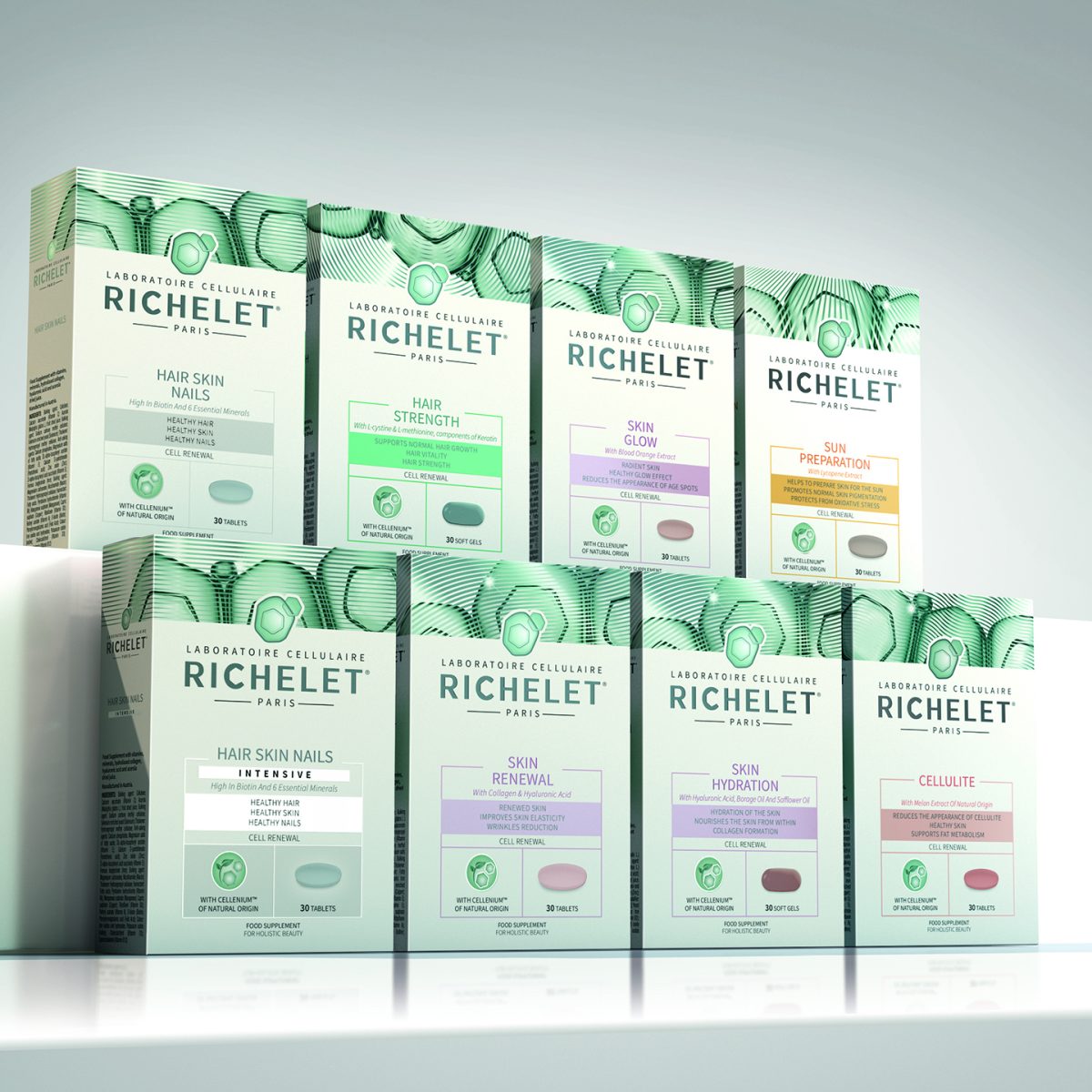
The first task which the agency tackled was the refinement of the brand marque to incorporate and emphasize the cellular element within it. In addition, to add the power of provenance, the marque needed to be framed within the Laboratoire Cellulaire, Paris setting.
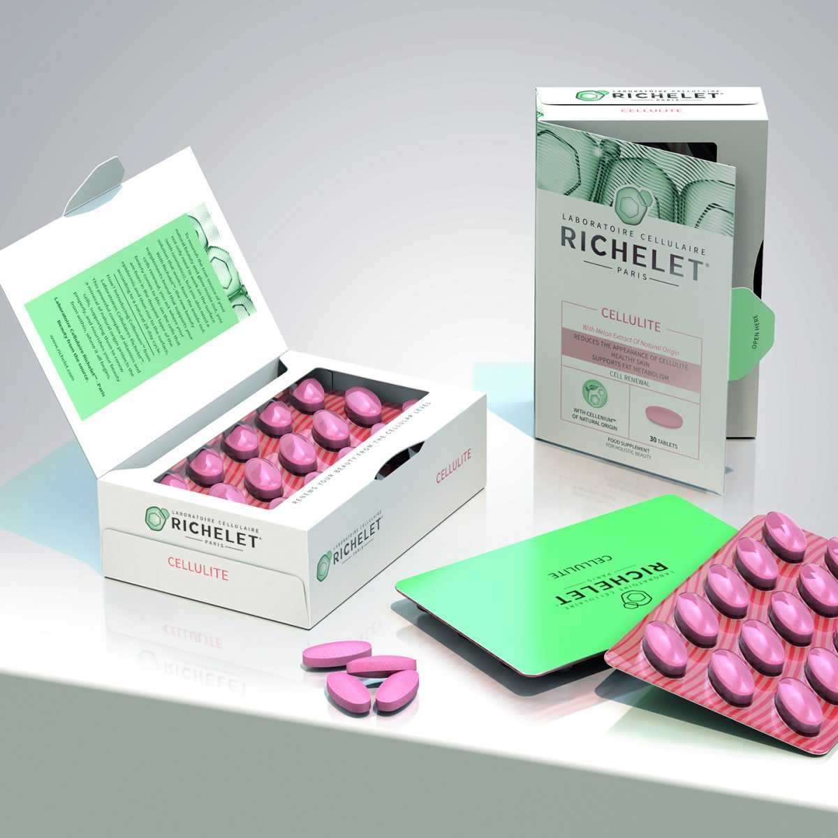
Matt Gilpin Design Director said, “We created a unique icon that features shape language inspired by Cellenium, the brand’s central ingredient. The packaging design balances white, green, and foil elements to reflect the brand’s laboratory heritage while allowing it to remain competitive in the beauty category.”
The supplements are fixed within an exclusive booklet mechanism, unique to Richelet. It was specifically designed in order to tell the story of the Richelet product in a longer format, whilst providing some theatre in the packaging by having an engaging reveal for the consumer.
A distinctive representation of cell renewal was created which was used across the top of the pack to hold the range together with a consistent motif.
The all-important Cellenium technology was given its own very individual icon to highlight the differentiating element, and the whole re-imagining was tinted with tones of the green brand color for consistency.
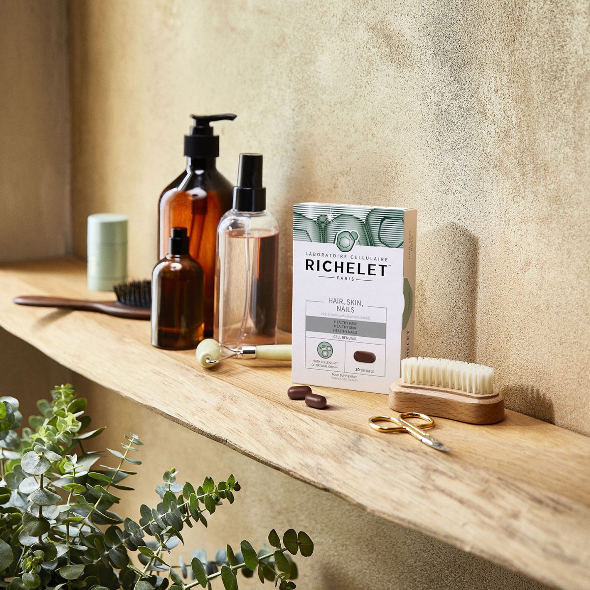
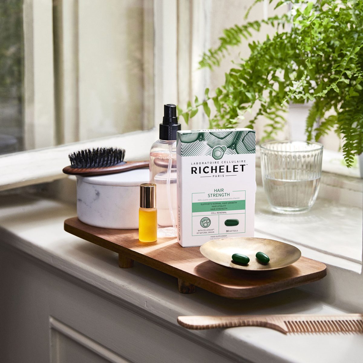
Four products, namely Skin Renewal, Skin Hydration, Hair, Skin & Nails, and Hair Strength, have been launched in French pharmacies in March 2023m promoted by a synergistic TVC.

