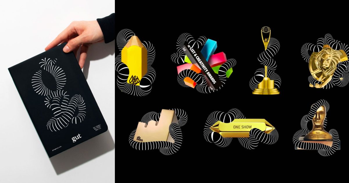
FLORIDA, USA — In 2018, when creative agency GUT first launched, one of the startup’s first order of business was to establish a logo and branding identity that communicated its clear direction towards creativity and business. With this, GUT Founder and Creative Chairman sought out the design expertise of Sagmeister & Walsh Co-founders Stefan Sagmeister and Jessica Walsh, creating the now-iconic “spiral intestines” logo of the agency.
Now, five years later, the Florida-based startup has grown into a network across seven countries, with over 500 employees. To mark this milestone, the agency geared up for a well-deserved tuning up on its fifth anniversary, working once again with Jessica through &Walsh to usher in a new era of “gutsy” creativity.


On the rebrand, &Walsh stated on its website: “This year, GUT worked with us to build out a library of brand assets, a customized gut intestine type & number system, as well as a sophisticated guidelines system that can easily be scaled and implemented across their different agency locations and creative departments around the world.”
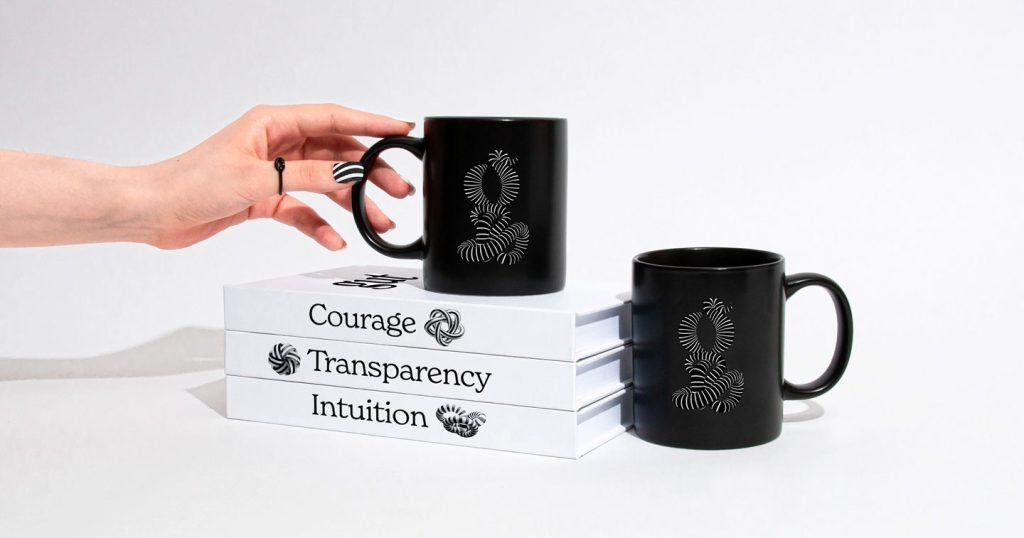
The design library consists of essentials such as the spiral GUT intestine’s very own type and number system and guidelines for numerous executions such as social media posts, spatial design, company merchandise, and more.


“We needed to solve for inconsistencies in how the brand was being implemented in each of their different locations in regards to typography, social media, photography, awards, company events, announcements, internal presentations and printed materials. To accomplish this, we built a library of brand elements and accompanying guidelines that includes sub-brand logos, illustrations, patterns and a custom alphabet, which allowed for more brand consistency across their touchpoints,” the website read.
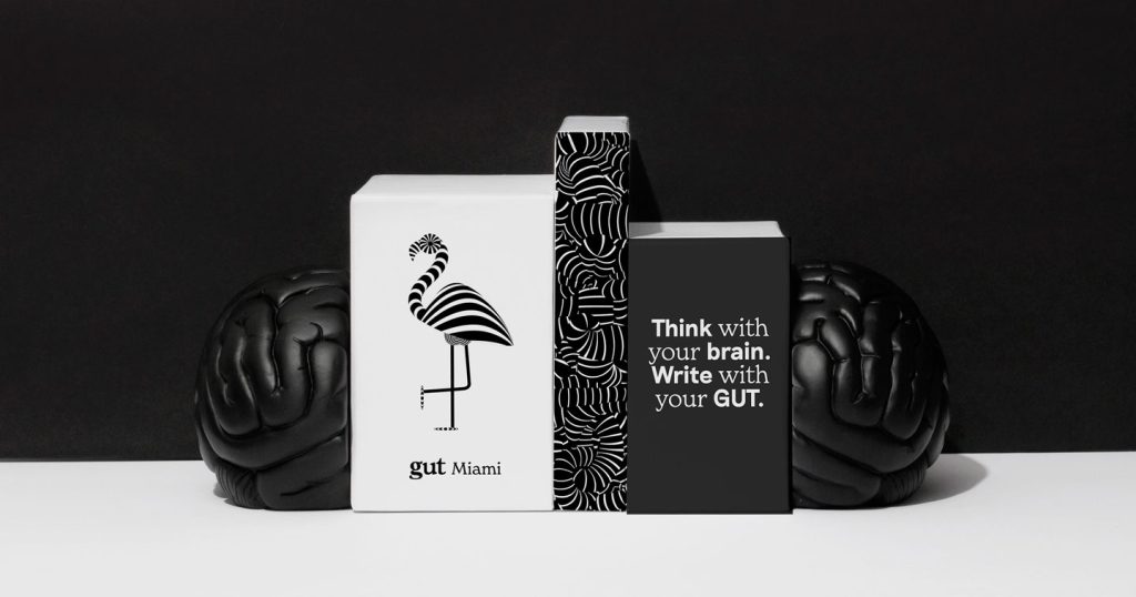
&Walsh also designed different city icons illustrating the agency’s locations worldwide — from Amsterdam to Buenos Aires, Toronto to Los Angeles, and more. Sporting the agency’s classic black and white motif, the city icons provide a unified look across all offices, while still representing a distinctly local identity for each one. The key elements for each city are also inspired by icons that embody their unique charm: a flamingo for GUT Miami, a bicycle for GUT Amsterdam, a palm tree for Los Angeles, and so on.
Another fun touch in &Walsh’s work for GUT’s brand refresh are the custom visuals for each trophy the agency has won since its inception in 2018. The spiral intestine envelops GUT’s numerous trophies from international advertising and creativity shows such as D&AD, Cannes Lions, The One Show, and so much more.
Learn more about GUT’s updated brand identity at https://andwalsh.com/work/all/gut-1/

