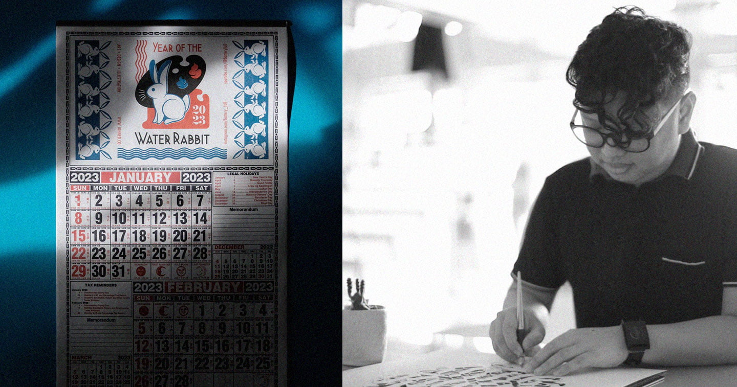
MANILA, PHILIPPINES — As the world kicked off the Lunar New Year last month, designers and artists everywhere joined in the celebration by putting a spotlight on the star of 2023 — the rabbit — in their works. From animation to everyday decor, the zodiac animal found its way to some amazing design moments that make for a promising start to the creative year ahead of us.
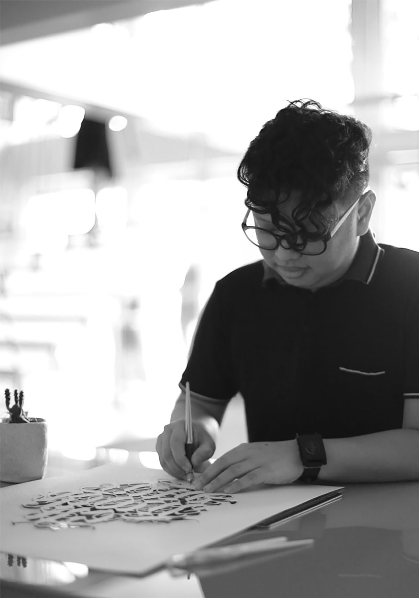
One of the Year of the Rabbit works that caught our eye during the Lunar New Year season comes from TBWA\SMP‘s John Ed De Vera, a Manila-based multidisciplinary artist who loves experimenting with new media, techniques, and art styles. For the Lunar New Year, John came up with a retro design for the Year of the Rabbit and turned it into the perfect limited-edition stylish tote bag and a New Year staple, a calendar.
Anyone familiar with his stunning paper-cutting works, many of which capture the essence of popular icons and characters while putting a spin on them, would not be surprised by how well John instilled nostalgia and comforting familiarity while also giving a fresh edge to his own take on a Year of the Rabbit design — one that would remind any Filipino of a certain iconic childhood sweet that also featured the animal.
John didn’t initially mean to create products out of the design. In fact, according to him, the idea just started from his wanting to make a simple paper-cut rabbit. “I brainstormed by myself in order to capture that imagery of a rabbit [and] put some twist to it,” he recalled. “The first imagery that came to mind was my favorite sweets. I checked the cabinet and found an expired pack of candies that I haven’t touched in years.”
“It was a nice idea for a social post. Kind of cute. But being in the creative industry, I didn’t stop there,” he said. “The Lunar Year was so close, so I figured it had to be something bigger than a post.”
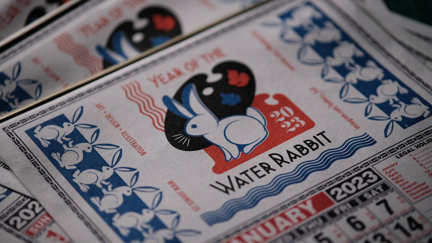
Hence, the fruition of the design didn’t end with just an Instagram post. Rather, John’s Water Rabbit found its way to the hands of friends, family, and lucky ones who managed to buy the limited edition pieces at Common Room last January. But what made John decide to go for tote bags and calendars for the New Year?
For the tote bags, John said he looked at his work and asked himself: What if you could wear the design?
“I also printed a few shirts as Christmas gifts,” he recalled, “but I decided to go with bags instead because, in terms of inventory, tote bags are easy to manage.”
With the calendars, the color palette of his design was what drove him to go with this product. “The colors were within the palette of a commercial Binondo calendar so it was perfect. My dad used to print those for his clients when we still had a printing press decades ago.”
He added that these calendars were also the perfect thing to revisit given the central message of this project. “[I wanted to convey that] simple, everyday things can be cool again, like the commercial wall calendar,” he explained. “We used to receive them from suppliers every new year as a giveaway but, as we shifted to ‘digital,’ we ignored their existence, they’re just there. In essence, it’s advertising — it’s about merchandising a small business’ brand or services throughout the year. And as the ‘client,’ the calendar is an expression of my passion for art, design, and illustration — my design portfolio.”

The attention to detail in incorporating the Water Rabbit design into the calendar is definitely evident in John’s work, from elements inspired by flattened candy wrappers to the water-reminiscent aspects of the patterns he included.
“Since there’s a blank portion in the calendar where you put your ‘branding’ and contact details, I based mine on the candy’s wrapper when flattened. I redrew everything from the main illustration elements and patterns on the side to recreating the font inspired by its packaging. The line patterns were also made wavy to signify water,” he said.
He even considered really driving home the homage to the candy by making use of edible paper for the calendar pages. He eventually decided against it, though, saying that he ultimately wanted the calendar to be accessible to more people. “I wanted to print on wafer paper so you can eat the calendar as the months passed,” he said. “It was a brilliant idea, but was very expensive to produce.”
John had a sketch of it as soon as he thought of the concept and finalized the artwork in a day. “You just know when you have a good idea,” he remarked. It wasn’t long after that he started the manufacturing process for the two products.
More importantly, it was a process with which he remained hands-on, from looking for suppliers to the moment he personally delivered the items — complete with die-cut rabbit hang tags he created — to Common Room Rockwell. According to him, he wanted the process “to be as authentic as how a small business would have them printed and produced.”
“I laid out the design into an existing calendar then went to Divisoria on a weekend with my mom to buy the blank calendars from her supplier,” he said, walking us through the production stage of this project. “After getting from the main source in Bambang, I contacted my mom’s printer and had the design color separated from another supplier. My dad used to ask me to ‘color sep’ and get the ‘negatives’ from his supplier, so it was a 360 for me but this time I was the client.”

“On the tote bags, I also had to source materials by myself and had them prototyped,” he continued. “Since they’re customized, I had them sewn by a friend’s seamstress in General Trias, Cavite who is a senior citizen so it can be another source of income for her during the holidays. When I had enough batches for printing, I sent them to a silk screen printer in Valenzuela.”
The authenticity and personal touch that he wanted to be present during this project were definitely there, showing in both his design and how he went about producing the actual product. It ultimately became his favorite part of working on this limited-edition Lunar New Year find as he saw the value not just in his concept but also in the collaboration and versatility he managed to tap into during the manufacturing process.
“From design to execution, my favorite part about the project was that it tested my versatility as a creative, by being hands-on and at the same time being collaborative with suppliers,” he said. “But most importantly, I enjoyed the whole production process with my mom’s support and looked back at the time I was being ‘trained’ by my dad.”
This is just the latest of John Ed De Vera’s many remarkable projects that show his eye for pieces from the past and our everyday lives that have a certain magic that art can bring out again. As we look forward to the rest of the new year, it’s design work like this that reminds us that sometimes it’s the details we find when we look to the past and the inspirations around us that allow us to move toward creating something new out of them.
“From a creative standpoint, there’s no single, original idea like we always say,” John said. “It’s how one connects the dots, from our experiences and points of view, to create new ones.”

