In this day of digital art and the vast array of tools available for manipulation, the term multimedia may be in danger of sounding generic, maybe even outdated. Luckily, there are many artists who remain open to the endless possibilities of pen and paper and aren’t afraid to swim across mediums. adobo Magazine had the privilege of sitting down with Melvin Galapon, a London-based graphic artist celebrated for his prolific mix of portraits, type, installations, video, and commercial work for clients like Nike, Nokia, Wallpaper*, The New York Times, Creative Review, BBH, Mother, British Airways, among others.
adobo: We’d love to learn more about your journey in graphic design. What started it all?
I’ve always been into the arts. It’s probably the only subject I’ve sort of excelled at. I originally wanted to be an architect or a product designer. While I was at Saint Martins, I was already going freelance work. One of my first commissions was from the New York Times, which was heavily art directed so it was really strange to work on my own thing to then being commissioned, then sort of being told what to do essentially and then from there, yeah, I’ve just been freelancing, doing my own thing.
We’ve noticed that you seem to work a lot with lines and glitches. Can you tell us more about this?
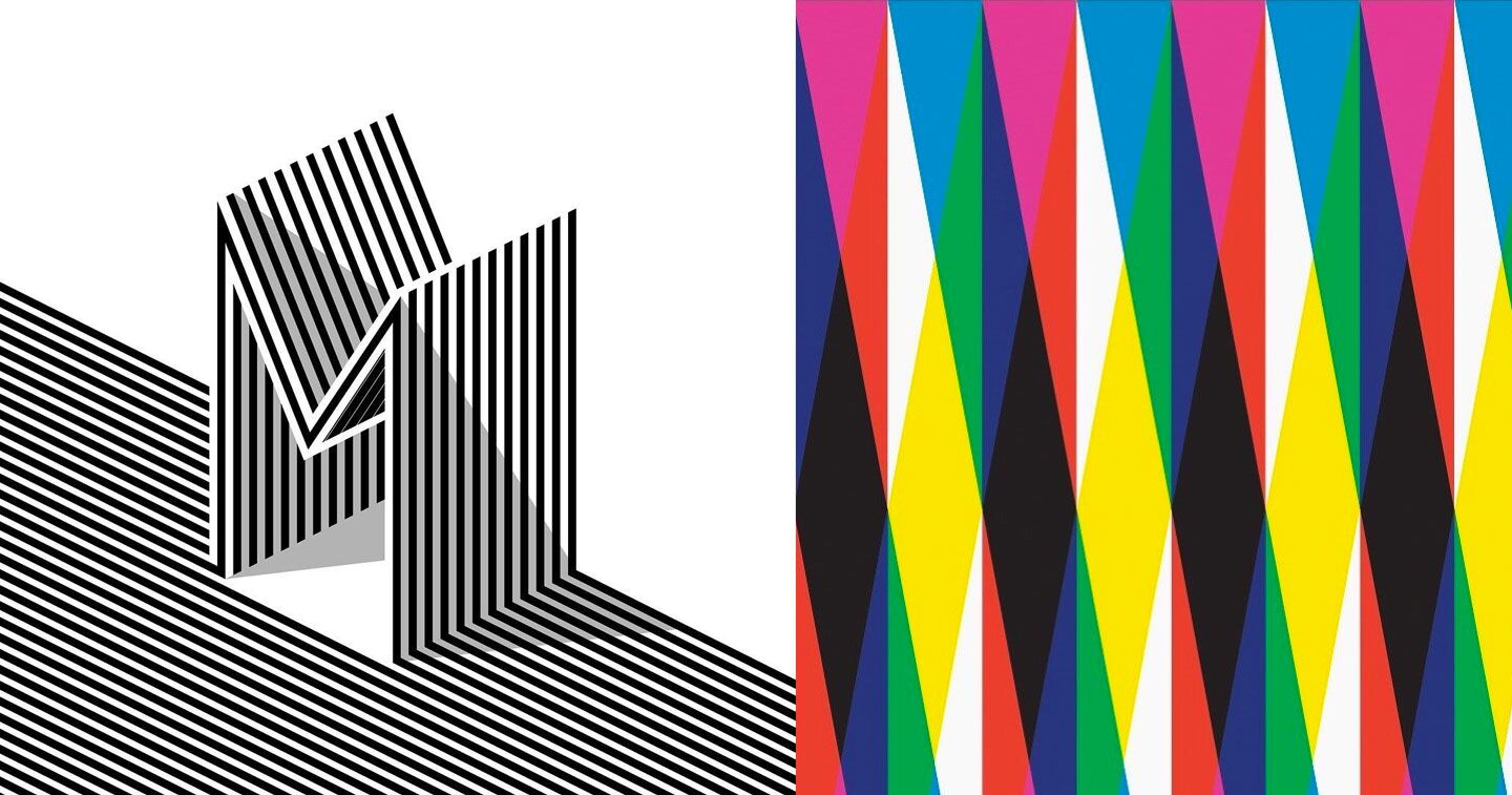
Before I did my MA at St. Martin’s, I was sort of building images out of objects. I [eventually] had a portfolio of work, which I used when I applied for my Masters. At Saint Martin’s, they really push you to figure out what you’re interested in and [for me], building all these objects out of almost like pixels—the thing that I realized is my interest—which I then turned into technology and old technology, then it turned into old TVs and old computer screens, which then evolved into the moray pattern where old CRT TVs (you know those lines when you get bad reception). That’s where I got my obsession with lines. I draw lines and make them look distorted, like the TV screen. And since then, it’s quite glitchy, linear, and also quite minimalist, clean.
What tools do you use?
I always start with pen and paper to work out an idea, whether it’s a little sentence or a little thumbnail, and then it depends on the projects. It goes to the computer next, and then I decide from there if it’s going to print, or if it’s for a commercial thing, or maybe something laser cut. But yeah, it always starts with pen and paper, then computer, then I decide which to work through.
Seems a lot of your references are from the past; is there any in particular that you find yourself going back to—like a dominant inspiration when you make your designs?
I’m an ‘80s child. I was born in 1981, so the technology and everything around that period when I was growing up inspires me. You talk about video tapes, because the video tape graphic sort of looks similar to the sort of thing that I do. There’s a brand called Scotch that had used lines in their work, and they had a 3D–like circle that’s part of their logo as well. There’s quite a lot from the ‘80s that influence my work, I think, especially with the colors. Neon colors—I use that a lot in my work.
So let’s talk about some of your projects. What has been your favorite project or work, so far?
For commercial work, there was a project I did for Creative Review magazine based in London. They asked me to do an annual cover; every cover that comes out annually, they ask a different designer to create an “A” in a different style. I created a laser cut–out of a clear acrylic, like a mirror base and I wanted to do something interactive—well, sort of like augmented reality so you hold your phone in front of the magazine and then a video would play with the same feel. So that was part of my favorite projects because the budget was really small, but the scope of what we could have done was really open. So, we can do anything then! I was really also trying to push the prospects of laser cut, and trying to push the motion side of what I do as well, so that culminated into this really perfect project of creating something really beautiful that was photographed, and then having something moving.
How about from your personal projects?
There’s a show I did last year at Book Club in Birra Moretti. That was like the first solo show I’ve done in a while. It allowed me to explore painting, which I don’t really do. I did paintings, laser cut, and sort of incorporated everything I’m interested into this one show, so that’s probably my most favorite thing that I’ve done.
You do a lot of design and at the same time, a lot of art. For you, when does design end and where does art start? You know, because there’s this huge debate about the difference between design, creatives and artists.
For me personally, the only difference [is] the art stuff is more personal and the design stuff is more commercial and you get paid for that, whereas art is more of something that you follow or are interested in. Some artists are quite lucky that they are able to the thing that they love as a commercial output. For me, they haven’t quite married at the moment just yet. For me at the moment, they’re quite separate.
I guess with design you’ve got a client whereas with art, you don’t really have a client. Your client is you, essentially, so you pretty much have free range in the art world, I guess. Well, within reason, and if you’ve got a market.
Can you point out anything in the Philippines, in Manila, around the Metro, that inspires you as a designer?
The architecture really inspires me. Just that mix of… when you’ve got something really brutalist—like the concrete architecture—then you’ve got plants, like really tropical, beautiful plants. I really like that mix. There’s an area in East London, that [has that same] feel here in Manila. In London, that sort of area [that brutalist architecture] is very isolated. There’s a project that I did that turned into a pattern project, based on my time here (in the Philippines) when I visited in 2014. It had very rigid sort of straight lines and plants sort of poking through. So yeah, there are things that had inspired me when I came here. It’s part of one of the reasons I like coming back here, as well as seeing family.
When you had that project, did people ask you where you get inspiration for it?
I guess you have to sort of see the thing that I’ve done. It sounds really bad, but I refer to it as fencing, like actual wooden fences, then you’ve got some plants poking through. Someone said, I really like those photographs you took of those fences. And I was like, it’s not a fence, I actually designed it, there’s a lot of thought being put into that! I didn’t just take a photo of a fence and put it on a t–shirt.
I went to BGC recently with a friend and he showed me these ridiculously big murals which looked absolutely amazing. Apart from seeing those in New York, I’ve never really seen stuff like that over here. And it’s the first time I’ve gone to BGC as well. It’s quite inspirational. I’d love to do a massive mural (like that), in my glitches style.
One last thing, we’re very interested in your video work. Could you tell us what it’s about?
The video work—I was always interested in making things very low–fi. The earlier stuff I was doing, again, it was playing with lines, but then projecting that over hand cut foam board. So when you filmed it from certain angles, it looked like it was a 3D or CGI sort of thing, but it was very handmade. That was for the Creative Review project, and something I did recently for Transport from London. For a music festival called the Latitude Festival, around 2010, they commissioned each artist to create a one-minute video loop, so the beginning had to match with the end. The theme was back and forth. I just had these poly styro head stuff; I don’t why or how I had these, but I’ve just always had it. From a previous project, I had a turntable. I had this really simple idea of this head rotating on this turntable and then splicing it up like it’s being glitched, and bits of it sort of rotating. So I filmed it by myself, edited it myself. I didn’t spend too long, but I had to cut all the slices up and worked out which bits sort of rotated. I think that mix of the handmade and new technology of DSLR cameras to create something new.
I know at some point I’ll have to do CGI stuff or try to mix those together. But I’m trying to focus more on doing handmade stuff. I’m working on two projects as live-action ones as well. One of them is lines projected over a model, and the other one is a half music video. We’re still in the process of figuring out how to shoot but yeah, I’m sort of playing with film as of the moment.

