Curated by Julian Vinzon
Behance is, without a doubt, the digital melting pot of brilliant creative work from designers, young and old, professional and amateur, from around the world. While scrolling through the portfolio website’s extensive collection, we found some very interesting identity makeovers that brands might want to take a look at.

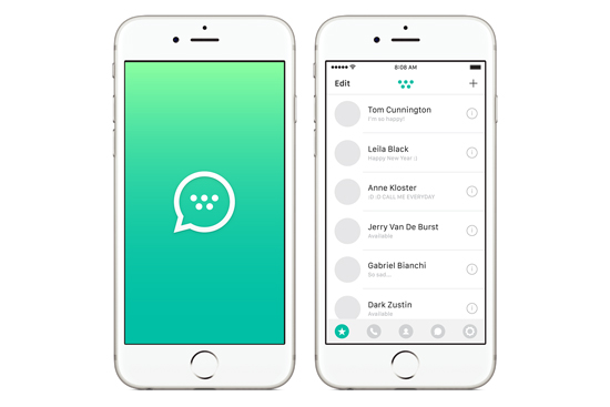
What our designer thinks: The design shows interesting iconography.
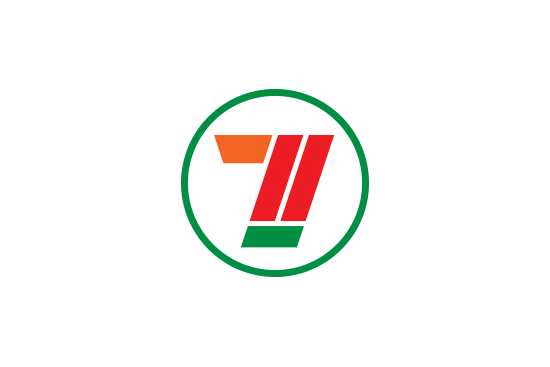

What our designer thinks: This gives 7-Eleven a sharper brand image. However, it doesn’t look as friendly as the original logo.

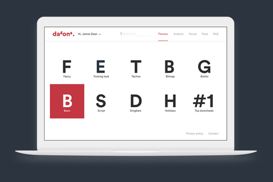
What our designer thinks: It appeals to designers because it has less clutter in the user interface, making the fonts more visible. I just hope it doesn’t get overpowered by loud ads.
Instagram, Facebook, Twitter, Youtube, Shutterstock


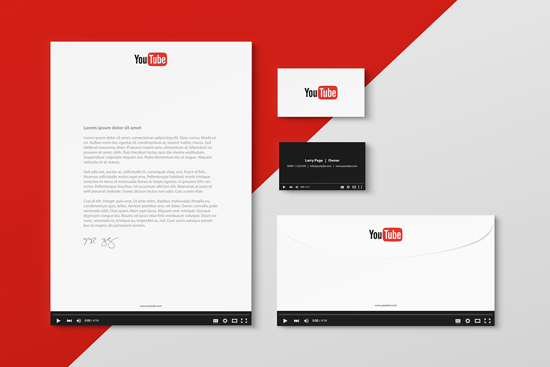

What our designer thinks: The proposed corporate designs reflect the brands very well. The fun and creative application of visual aids reinforces the brands’ visual identity.


What our designer thinks: Well, it’s like a Pokemon hipster edition.
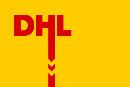
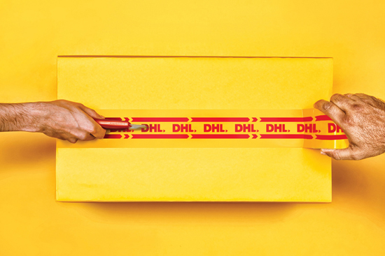
What our designer thinks: Getting rid of the skewed logo is a nice move. The stylized arrow can serve as a DHL trademark.
ABOUT THE CURATOR: Julian Vinzon is a graphic designer at adobo magazine


