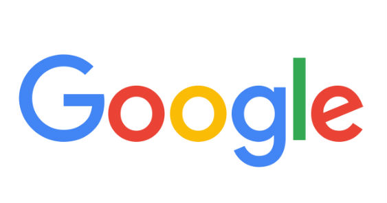
GLOBAL – At first, you would think it’s just another Google doodle but once you point the cursor to find out from the hover text what the doodle is for, you will see that it says “Google’s new logo”. You crease your eyebrows for a split second before finally clicking on the Google logo to know what the hell that hover text is talking about. Then, you see the old logo being wiped out by a virtual hand which goes on to write the new logo using colored chalk. And then it sinks in–oh, Google has a new logo!
Unlike Facebook’s seemingly unnoticeable logo tweaks, Google made a substantially huge change. From the classic serif font based on the Catull typeface, the new logo is now sporting a sans-serif typeface called Product Sans. This is the biggest change that Google’s logo has undergone in 16 years.
The small letter ‘g’ in the search engine company’s favicon has also been changed to a colorful capital ’G’ that slightly reminds you of Picasa.
Google said in a statement that the logo redesign aims to make the identity adapt to whichever platform that users are using to interact with its products, be it on a desktop, tablet, or other mobile devices.
“As you’ll see, we’ve taken the Google logo and branding, which were originally built for a single desktop browser page, and updated them for a world of seamless computing across an endless number of devices and different kinds of inputs (such as tap, type and talk).
It doesn’t simply tell you that you’re using Google, but also shows you how Google is working for you. For example, new elements like a colorful Google mic help you identify and interact with Google whether you’re talking, tapping or typing,” said Tamar Yehoshua, VP, Product Management & Bobby Nath, Director of User Experience.
Google also added that the new logo also reflects the many ways that the brand works for users beyond just a search engine but as well as products like Maps, Gmail and Chrome.
“We think we’ve taken the best of Google (simple, uncluttered, colorful, friendly), and recast it not just for the Google of today, but for the Google of the future,” added Yehoshua.
The new identity will be visible across all of Google’s products in the coming days.
Watch the evolution of Google’s logo:


