LONDON – D&AD launches its 55th Annual, with President Bruce Duckworth selecting Jim Sutherland as its designer; a D&AD veteran and founder of Studio Sutherl&, the most awarded design studio at D&AD 2017.
Each year, D&AD’s Annual brings together the ‘best of the best’ in creative work; a bible of inspiring projects from around the globe for anyone part of the design and advertising industry. And while last year’s Annual focused on learning, this year’s has thrust the limelight back onto the designers and creatives themselves. As Bruce Duckworth’s final act as President, he set the challenge to encompass all of D&AD’s history and glory in one book, and to cement the Annual as the yardstick for the huge number of creative disciplines that D&AD awards.
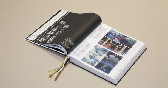
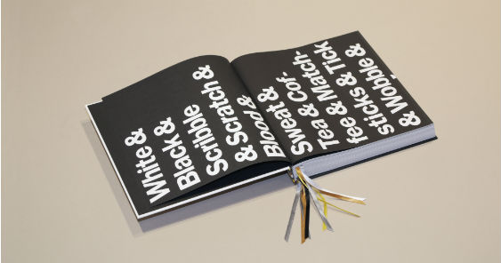
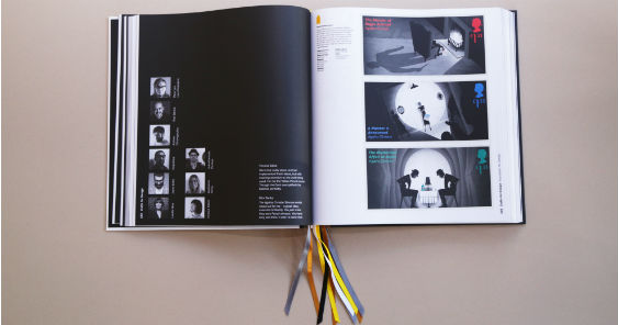
So what’s new? To refocus the design and advertising community’s attention on its own work and most promising talent, the Book has been stripped back to a minimalist, modern and clean design. The interactive Annual contains ten bookmark ribbons, so readers can flag multiple favourite pieces and inspiration. What’s more, the ribbons are colour-paired with the much sought after D&AD Pencils, so readers can flag the work in order of inspiration, giving the highest accolade of the black ribbon to the project that inspires them the most. During the design of the Book, Jim Sutherland worked closely with Nick Asbury, one of the most awarded people in the D&AD Writing for Design category. Nick was tasked with creating wording that speaks to the design process of any project. To introduce the work held inside, the words ‘& Design & Art Direction & Wood & Graphite & Yellow & White & Black & Scribble & Scratch & Blood & Sweat & Tea & Coffee &…’ were carefully selected to reflect the thought, effort and pain that goes into every creative project. To wrap up the Annual, words were chosen that encapsulate the judging and critiquing process, alongside every creator’s ‘so, what’s next?’ question, words like ‘& Agree & Differ & Love & Hate & Desire & Dream & What If & What Next &…’.
Sponsor
Jim Sutherland, on the design process: “The real challenge for me was designing a book that didn’t overwhelm the work inside. We needed to celebrate the work without getting in the way of it, and hence a very simple design was born. Every year, designers and creatives take inspiration and stimulation from the Book so we wanted to create an element of interaction that allowed readers to award their favourite work with D&AD Pencil-coloured ribbons. I also felt that book spines are often neglected, even though it’s actually the most seen part of a book, so we created this effect of the coloured stripes on the spine spilling out of the book itself. The process has been such a joy to work on, and seeing it in the D&AD offices alongside Annuals past means a lot to me.”
On what the Annual means to him: “D&AD is what inspired me to do what I do. When I left college, it was on my tutor’s suggestion that I headed to the library to leaf through the D&AD Annual of that year, to help decide where my future lay. Many years later, D&AD is still both inspiration and motivation to myself and the wider design and advertising community, so it was an honour – albeit a terrifying one – to have been asked by Bruce to design the Book this year. With creative work so readily available now – on blogs, on Instagram etc. – the Annual remains so pertinent due to the knowledge that each project has been subject to a rigorous judging panel of some of the best names in the industry. It’s not simply a record of award recipients, but a curation of the best design and advertising work from around the world and stimulation for future work. I was reunited with that first D&AD Annual that I ever encountered very recently, and the creatives that were winning awards back then are now heavily involved in D&AD, so it’s a dream realised for me to be involved in this process.”
Bruce Duckworth on working with Jim Sutherland: “I’ve known Jim for many years and have always loved his work, so the Annual seemed the perfect opportunity to collaborate. We wanted to create something with a sense of longevity in order to credit the exceptional work inside and generate a feeling that it is here to stay. The challenge was to do this without compromising on the eco-friendly aspect that was brought in with last year’s Annual, which I think Jim has done wonderfully through the combination of a long-lasting heavy cover and lightweight paper interior. I asked Jim not to think of the book as a flat object, but rather as 3D, which is exactly what this design does with the dramatic bookmarks and the whole design revolving around the spine. The drama this creates is a response to the renewed confidence that D&AD has at the moment. Incidentally, the inspiration for multiple ribbons comes from Bible study, which somehow seems appropriate.”

On D&AD’s focus on collaboration: “The repeated use of the ampersand bookending the Annual highlights the importance of and need for collaboration in the design and advertising world. It’s a celebration of the ‘&’ in D&AD and the excellent work this creates. Collaboration is key for creativity and it’s what connects advertising with design which is so central to D&AD. Even if you look at the credits on projects now, compared to those in previous Annuals, the lists are much longer due to the huge variety of people working on these projects, which again reflects D&AD as a melting pot for a large number creative disciplines.”
The Annual is available from 15th September 2017 at https://www.dandad.org/annual. See the work included here.
For the fourth year running, D&AD’s partners at Hogarth have provided the retouching, colour management and general reprographics for the Book.


