by Irma Mutuc
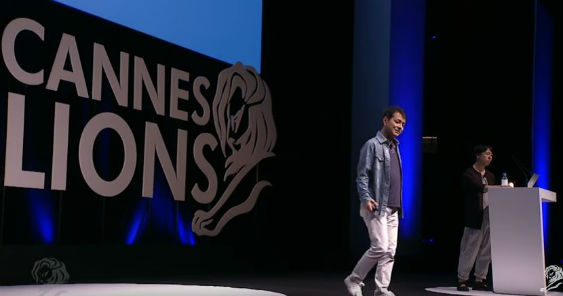
CANNES – Dentsu Tokyo’s Creative Director, Yoshihiro Yagi, a 28-time Design Lion Winner and their Chief Strategy Officer, Koichi Yamamoto, made a valiant effort to try to define design for their Cannes audience.
They said that design is everywhere and it’s not just visual or taste. Sometimes that may be true but that’s not all design is. We need to look at the possibilities of design beyond its current applications.
Design is Nature
Design is about returning things to its natural state. To illustrate, they showed the example set by Akinori Kimura, who spent ten years of his life perfecting the way to grow organic apples with no fertilizer, no chemicals. He just let the undergrowth thrive with overgrown weeds, bugs and other small animals. This allowed the soil to return to its natural habitat, “The crop is the hero. I’m only the helper. By bringing the tree to its natural state, you bring out the natural strength of the apple. ”
Yamamoto-san applied the same thinking to brands by saying that brands should learn ot to solve issues in the short run but to dig deep to find the real truth and solve issues from the fundamentals. The essence is to bring to light the natural strength of the brand and product. Or the brand will rot.
Yagi-san corroborated Yamamoto-san by citing as example his ‘Get back, Tohoku’ campaign for the East Japan Railway Company where they used the design on the face of the local trains as motif after knowing that engineers treat the trains like pets and thus, give them nicknames.
Design is Necessity
Oftentimes a need can create beautiful design. Yagi-san illustrated this by showing the bright-painted houses in Burano Island in Venice, Italy. Locals explain the origin of the practice in two legends. One, it was because the fishermen liked to see the bright colors or their houses while they’re out at sea. Two, when a plague hit the island, they had to paint their houses with lime to prevent its spread. Some people mixed color in the lime, perhaps to differentiate or brighten up their house. As practice, the color of a family’s house will remain unchanged for generations so if your ancestors house was yellow, then all succeeding generations of that family will have yellow houses. As an additional example, Yagi-san also cited the magnificent embroidery of the island, which originated from net weaving. Today, the island produces exquisite embroidery, the process of which is elegantly called “weaving air”.
Design is Culture
Yagi-san shared his trip to Okinawa Island, the Southermost prefecture of Japan, to have a first-hand experience in the Ryukyu culture. He showed the fascinating traditional Ryukyu dance where the beautiful patterns and designs in their kimono and headgear has meaning in their history. In the dance, they even integrate designs such as the wearing of bright red foot wear so when they walk, a splash of color peeps from under them (an influence from China and mainland Japan). They call the design mix from different cultures ‘Chanpuru’. In the same culture, blown glass making is also popular.
The craft started during the Second World War when they used Coke bottles to make magical glassware. Yagi-san found elements of design in the movement of craftsmen because even when it’s crowded in the workshop they never bump into each other. They explained that it’s because they follow one simple rule: Make way for those carrying glass.
Design is Logic
Logic is critical to design as it is important to art and business. Yagi-san showed his package design for Magic (Menicon disposable contact lenses). The One-day Menicon packs are flat and thin and when you open them, the lens pops out. This is so you can take them out easily without touching the inner face of the lens. It’s attractive, practical and hygienic. It does not only look good but it conveys the message of the ‘good morning concept ‘ from the insight ‘People start a day by getting their vision’. The campaign further conveys this by using the image of a lens popping up with the image of a rising sun and the tagline, ‘New Dawn’.
Design is Touch
Design needs to be tactile. The sense of touch is important and people appreciate and understand design more if they can touch it. As an example, Yagi-san cited ‘Iron Mind’ which he designed for the 2013 One Show exhibition in Japan. To express strength of faith of the talented creative, they used steel framing as a motif.
Design is Research
Ideas often come from research and not inspiration. To explain, Yagi-san took the audience with him to Ultrecht in Amsterdam, birthplace of his design hero, Dick Bruna. He explains that he finds his designs bold because they are very simple. He only keeps what is essential. He relies on stacks and stacks of National Geographic magazines as reference for his drawings and yet when he draws, one will notice a huge gap between his reference and the final product. He take sin every line and then simplifies it to the barest minimum. There’s power in every stroke.
He also cited as example ‘The Beautiful Black List’ an exhibition for the D&AD 50th anniversary which featured historical Black pencils. They used the whale as a design motif because of its extraordinary power which the design team found out through research. To further enunciate the value and strength of the Black Pencil, they also decidedly colored the whale black.
Another example was The Grand Budapest Hotel, a multi-awarded period movie. Its Lead Graphic Designer, Annie Atkins, shared, “I like researching in flea markets because when you see them online they’re flat but in flea markets you get a sense of scale and texture.” She also stresses that it’s never about creating realistic props but to help create the authenticity of the film story.
Diversity is the strength
Not just in solving problems, design can get us thinking and make us aware of issues. Make us question the way we see things. Yagi-san underlined this by way of Panasonic ‘Life is electric’ experiment which was designed to change people’s view of electricity. People take it for granted because they don’t see it. What if we can “see” electricity? Panasonic charged 21 analog batteries in 21 different ways (muscle, water, tangy fruits, etc). The charged batteries were sold through ordinary channels and the buyers instantly shared their stories in social media. Through this, the brand was able to start a conversation about electricity’s real value to people.
Former Creative Director & Digital Strategist of the White House, Ashleigh Axios, also shared her view on a video, “It’s not just about politics but design for positive social good, to help people make lives better. Design is about life and making life work for people. Good design supports the human experience.“
In the end, the Dentsu duo presented many other views on design and ended their talk with the realization that design means different ways to different people. And that’s possibly the very reason how design stays alive, dynamic, powerful, and relevant.


