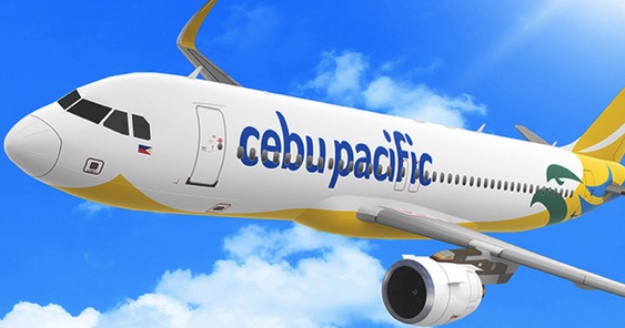

MANILA – Cebu Pacific Air recently underwent a facelift after 19 years of operation to reflect its expansion from the domestic low-cost carrier of choice into an international brand.
The changes include a new logo, livery, colors and even a redesign of its familiar plane mascot, “featuring shades of the Philippines’ land, sea, sky and sun,” Cebu Pacific said in release.
The project was led by Singapore-based agency Bonsey Design. “The symbol of the airline, the Philippine eagle, once dark and complicated, is a lighter, fresher icon with a more modern wordmark tying it all together. We extended the identity through all marketing and communication touch points,” to the airplane livery and crew uniforms, the agency said in its portfolio showcase online.
Below is an official video from Cebu Pacific talking about the brand change.
“We have always prioritized building an extensive network within and from the Philippines, because we know how much air travel makes a difference in the lives of Filipinos. We bring the Philippine warmth and sense of fun everywhere we go. Now, with the Philippines natural colors on our logo, we showcase the country to the world,” said CEB VP for Marketing and Distribution Candice Iyog.