Max’s Group integrates, updates newly acquired Pancake House Group brands
MANILA – It’s a dilemma marketers have faced at one point or another: At what point should they stop when refreshing a brand?
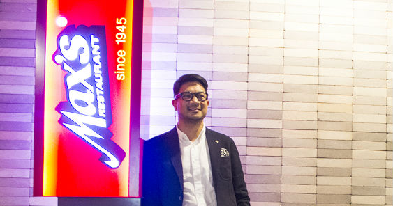
Jim Fuentebella (in photo above), director of the newly rebranded Max’s Group Inc, home to 12 household names in the casual restaurant space including Max’s Restaurant and Pancake House, confronts this quandary daily. In addition to home-grown brands, the group also has the franchises for US brands, Jamba Juice and Krispy Kreme.
The restaurant group is in the early days of freshening up the look and feel of three of the 10 restaurant brands that came when Max’s acquired Pancake House Group for close to 3.5 billion pesos early this year and integrated it under the Max’s Group Inc banner.
“You can get carried away because you can,” said Fuentebella, a third generation member of Max’s founding family, of the refresh underway at Pancake House, Pinoy-style pub restaurant Dencio’s and Teriyaki Boy.
“The brand position is already strong. All we needed to do is refresh the brand positioning. But that requires discipline to get to a certain level of execution because it’s easy to lose the soul if you start putting a lot of things that are new.”
For Fuentebella, the word patina has served as his trusty guide.
“Patina is a very good word because it comes with age; it’s nurtured, it has a certain luster. Age doesn’t necessarily mean old. There’s a certain amount of care and maintenance that comes along with patina. We didn’t want to take that away.”
So concerned was Fuentebella that the founders of Pancake House, Dencio’s and Teriyaki Boy were consulted to better retain their restaurants’ authenticity during the refresh.
“We value authenticity. How can we be more real than by getting into (the thinking of) the person who founded the brand?” Fuentebella said of consulting Dencio’s Dennis Nakpil and Teriyaki Boy’s Bryan Chu.
The founders enlightened Fuentebella and company about the “values” of the menu they created and the experience they wanted to deliver to their customers.
For Pancake House though, the store design will not be something diners are used to seeing from the 40-year-old chain, which has 109 locations nationwide.
An archetype of the new-look store, complete with a revamped logo, is under construction in Batangas and was due to open at press time.
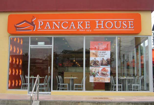
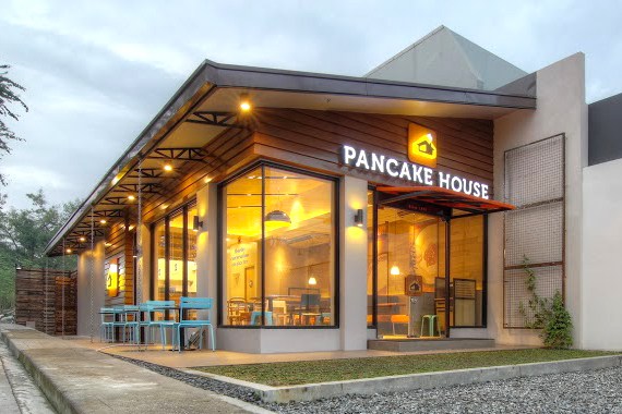 Pancake House: Before (top) and After (bottom)
To a large extent, the site’s less-than-ideal long and narrow footprint coupled with Pancake House’s brand stories inspired the new store design, which was modeled on the idea of a shack/shelter/shed. “(The long, narrow design) reminded me of a waiting shed – it fills a need, it’s humble in origins, you use it for what it is because it has value when you need it, and then you’re gone,” Fuentebella said of phrases he believed described Pancake House to a T. Shack/shelter/shed conveyed feelings of coziness and warmth.
The brand will still have its trademark orange hue but updated: The color will actually have a glow about it. “We’re not taking it away, as the equity of Pancake House has a lot to do with the color orange… it’s how you manifest the orange. That’s how it contributes to the feeling you want diners to associate with when they come into a Pancake House – warm, friendly, cozy, homey,” Fuentebella said of the hue associated with the brand from its founding in 1974.
“The orange will work better within the range of a family of colors – it’s that combination that was relevant in 1974. We don’t have to reinvent retro for Pancake House to be relevant because the brand is it. We just have to search our archives to see what will make it more exciting.”
Graphic design studio B&C, which worked on refreshing Pancake House’s logo a decade ago, has once again modernized the logo, anchoring it with a chocolate brown base.
Bonifacio High Street, as well as Burgos Circle at the Fort, and Molito in Alabang will be among the first locations in the Metro to offer the new Pancake House store look.
Teriyaki Boy’s refresh is, meanwhile, an evolution of the look architect Ed Calma created a year ago for the Katipunan store.
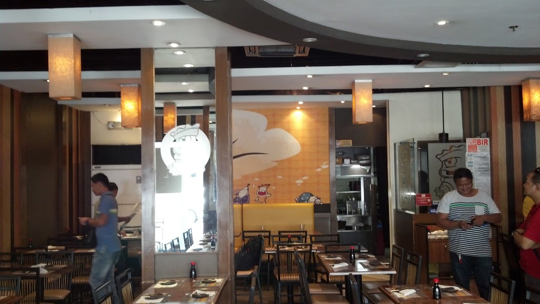
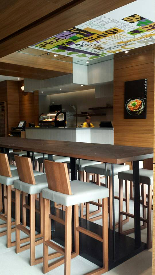
Teriyaki Boy: Before (top) and After (bottom)
Raw woods and natural elements such as rocks were combined with drop lights to inject more of a Japanese experience in the Glorietta store. For the next store due to open in Burgos Circle, interior designer Maja Olivares-Co of SSOA has been tapped to build on the Glorietta store design. “It creates more of an anchor, more of a platform for Teriyaki Boy.”
For Dencio’s, new flooring and bathrooms have been installed along with a more extensive bar, while signature elements such the decorative rattan balls have been updated, underscoring, on the one hand, the brand’s Pinoy resto-bar positioning while also giving it a fresher take. “It is still very much Dencio’s, as opposed to something totally different,” said Fuentebella.

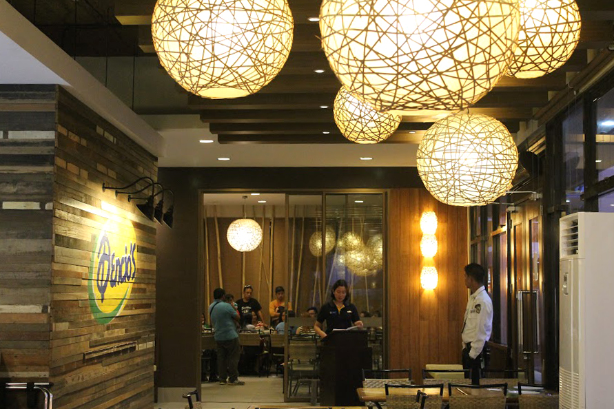 Dencio’s: Before (top) and After (bottom)
There will also be a greater variety of beer brands, which will be served very, very cold, and the sisig is back to the original recipe – two items described as “real drivers of the brand”.
Will all these investments translate into higher prices at the store?
“It’s not about increasing prices, because we want to make so much money out of a single SKU, but what the market can afford and having the experience they’ll come back to.”
With 12 brands from the two combined groups now integrated under the Max’s Group Inc, Fuentebella believes the company will have the purchasing muscle to source better produce and other supplies to provide greater dining value.
“We are not defined by the 12 brands that we have. The vision is to build loved brands and we want to make sure that the brands we carry in our portfolio echo that vision strongly,” he said of the group’s ambitions to expand its portfolio.
Words Sharon Desker Shaw
Photos courtesy of Max’s Group Inc.
For Max’s and other stories, including the multi-awarded ‘Sweetie’ initiative from LEMZ and Clio and Spikes winners, check out the latest issue of adobo on newsstsands today.

