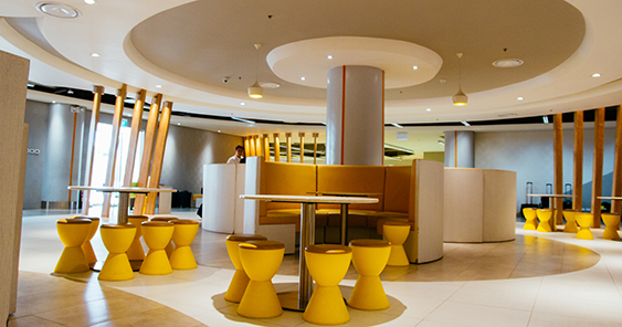
The long table of the board room overlooking the runway and its parked jetliners is, quite literally, a giant board game, with clusters of oversized multicolored game pawns and cushy dice amid the long-stemmed conference microphones and corporate table calendars. The meeting rooms are all named after destinations so that colleagues can have a meeting at Tokyo, Dubai, Hong Kong, or Bali. Walls are adorned with cheerful cartoonish murals and illustrations by Studio Dialogo. The long expanses of glass partitions that trace the curvature of the rooms and hallways are subtly yet playfully etched with tiny icons representing ground crew—all the better for visibility and safety. The lounge is a wide open space punctuated by cozy circular nooks that encourage flight attendants and pilots debrief, unwind, banter, and chat.
All these well conceived touches of interior and architectural design by John Yuyucheng. But by far what makes the Cebu Pacific Air head office at the airport’s Domestic Road stand out are the people who enliven it.
People centered hub
Bevies of statuesque and svelte flight attendants all dressed in Cebu Pacific’s trademark yellow cardigans, denim skirts, tropical print scarves, and straw fedora hats all jauntily tilted—an ensemble composed by no less than, aptly enough, Cebuano fashion designer Jun Escario—complement the nattily dressed pilots with gold striped epaulets, peaked caps, and winged aviator’s badge. Their standard issue trolley bags—all embroidered with the Cebu Pacic logo—are parked to one side of the wall like airplanes waiting to taxi on a runway. They all smile warmly and stand tall proudly.
Candice Iyog, vice president for marketing and distribution at Cebu Pacific Air, explains, “The office does not make the culture. It was really the culture that we’ve cultivated from the very start and moving us to this office. We wanted to make sure that we had a space that was aligned with our culture as a company which is open, collaborative, very family oriented, and still very young.”
“The icons, the murals, and if you look at the themes, it’s really built about around the people. This space is for our employees, and we wanted to make sure that everyone could relate and feel like this space was built for me,” she notes.
Budget and classy
The entire office seems perennially bright, shiny, and new, like a child’s toy newly unwrapped and unboxed. Nothing is faded, soiled, or scuffed. Once again, it the people themselves who call this their head office who make it cheery and fresh the most. It’s hard to believe the office is already two years old, or that it belongs to a budget carrier.
She explains, “It’s actually pretty smart. It’s because everything’s budget. We are still a local carrier. That’s still our business model. That’s why if you look at our offices, there are no carpets. We built everything so it’s easy to maintain. It’s fairly simple, clean, and functional. But there is a way to make it feel more stylized and not as monotonous and a little more fun. The structure was built around the fun, young, and dynamic personality of the airline. If you look at the hallways, it’s curved. It doesn’t cost us anything to make it curved. It’s a just a little more attention to details.”

